Civis is a concept platform that asks a simple question: what if government services were organised around the citizen instead of the org chart? Fragmented services, scattered logins, and institution-shaped language force people to understand how government works before they can do anything with it. I used Civis to design a single, calmer front door — reducing cognitive load, making accessibility foundational, and defining consistent patterns across payments, identity, appointments, documents, and service access.
The challenge
Public services are spread across different departments, websites, logins, and mental models. To complete even an ordinary task, a citizen is quietly asked to model the structure of government first — to know which body owns their problem, what that body calls the thing they need, and which portal to start in. That burden falls hardest on the people with the least time, the least confidence, or the least well-met access needs.
- Services fragmented across departments
- Multiple websites and inconsistent experiences
- Inconsistent terminology for the same real-world thing
- Complex forms and unclear requirements
- Poor accessibility foundations
- High cognitive load
- Users forced to think like institutions

Discovery & research
Before designing anything, I ran a solo discovery to understand why public services feel so hard — a heuristic, desk-based read of existing government portals rather than a formal user study. I mapped common tasks, walked real journeys, compared how different services named the same things, and looked for the recurring reasons a citizen ends up having to think like an institution. What follows are my observations as a designer, framed as heuristic reads rather than measured findings.
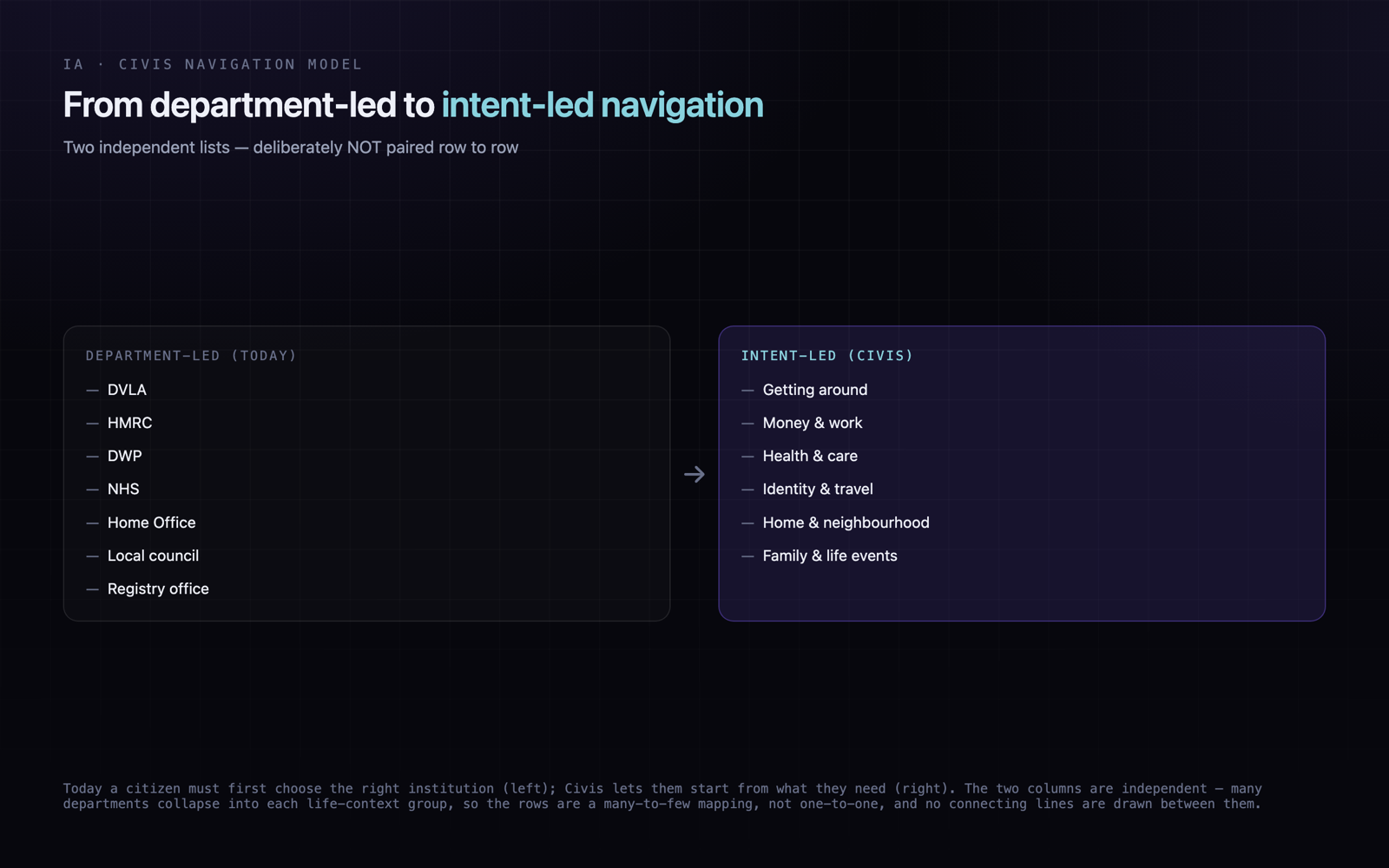
Citizens are asked to model the org chart first
Services are arranged by which body owns them, so the first decision a person faces is institutional — who is responsible — long before they can express what they actually need to do.
EvidenceAcross the portals I audited, the opening navigation choice was almost always 'which department', not 'what do I need to do' — a pattern I observed repeatedly across the sites I mapped.
Continuity breaks at every hand-off
Moving from one service to a related one usually means a fresh login, a different layout, and lost context — the journey resets instead of carrying the person forward.
EvidenceContext tended to degrade at the hand-offs I traced: a new sign-in, a different visual language, and no carried-over state between one portal and the next.
Inconsistent terminology raises the load
The same real-world thing is named differently from one service to the next, so a citizen cannot build a stable vocabulary and has to re-learn language at each step.
EvidenceWhen I compared services side by side, the same concept often appeared under different labels, so I could not rely on a consistent term to guide me through.
Forms assume institutional knowledge
Requirements are written from the institution's point of view — reference numbers, eligibility rules, department names — which the service itself never surfaces or explains.
EvidenceSeveral forms I walked through assumed the user already knew a reference number, an owning department, or an eligibility rule that the flow never made available.
Accessibility reads as an afterthought
Accessibility is uneven across services, suggesting it was retrofitted rather than treated as a starting constraint for the interface.
EvidenceOn a heuristic accessibility pass I noticed recurring issues — low-contrast states, unlabelled inputs, focus order that did not follow reading order — enough to suggest accessibility was not foundational.
Trust cues are confused with friction
Security steps are often presented as warnings, so protection reads as intimidation rather than reassurance, and confidence drops at exactly the moments it should build.
EvidenceIn the flows I reviewed, heavy warnings and dense legal copy tended to appear where a calm, plain explanation would have done more to build confidence.
How I approached it
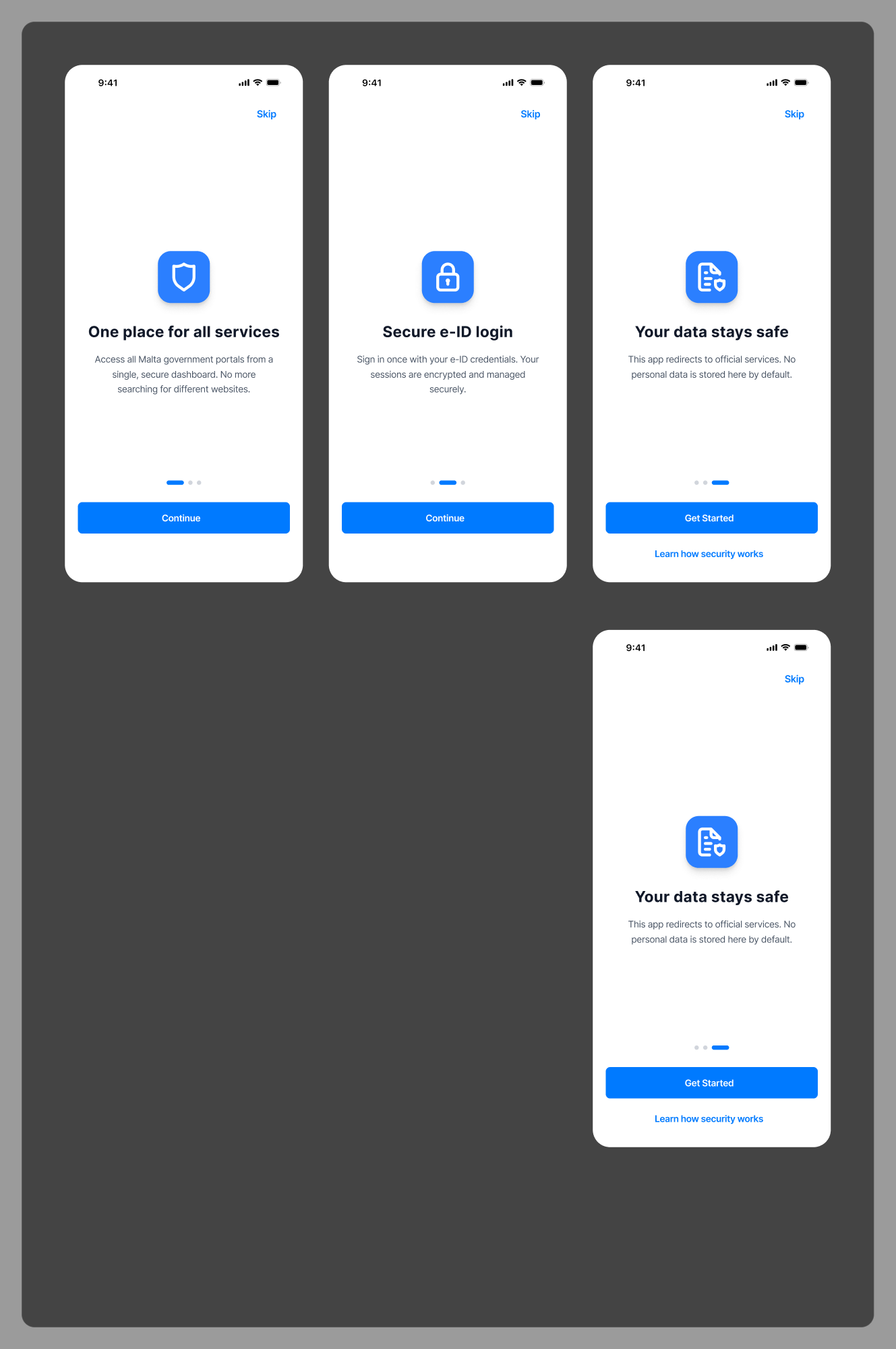
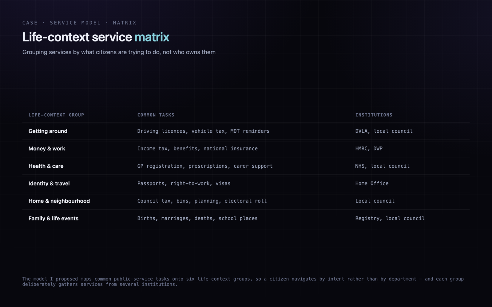
Rather than designing isolated screens, I set out to define a shared service framework — one system that many services could inherit. I mapped common public-service tasks, grouped them by life context, and then worked out the reusable parts: navigation, forms, validation, error and empty states, progress feedback, identity, documents, submissions, and service updates. The aim was consistency a citizen could learn once and reuse everywhere, instead of relearning each department from scratch.
Mapped common public-service tasks
Grouped services by user need and life context
Created a shared navigation model
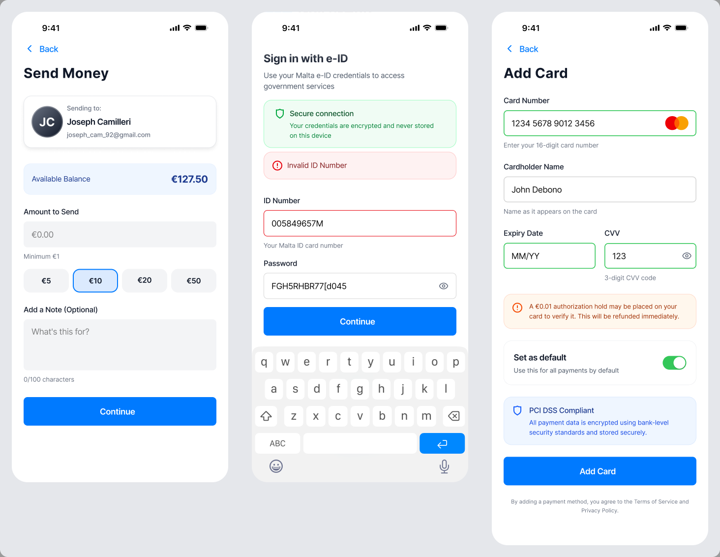
Defined reusable form and validation patterns
Designed identity, wallet, documents, and update flows
Prioritised accessibility and plain language
Reduced cognitive load through progressive disclosure
Trade-offs
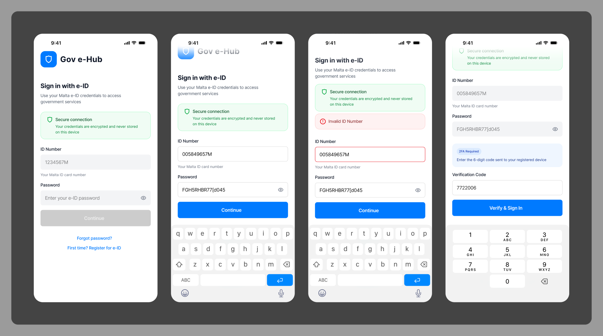
The hardest tension was trust versus friction. Government services genuinely need security and credibility, but when every step reads as a warning, people lose confidence and abandon the task. I had to design steps that felt reassuring rather than intimidating, and apply one consistent model across service types that behave very differently.
- Trust without intimidation
- Security without excessive friction
- Accessibility across complex, multi-step flows
- Clear language for service requirements
- Consistency across very different service types
- Adapting one model to many departments
Final direction
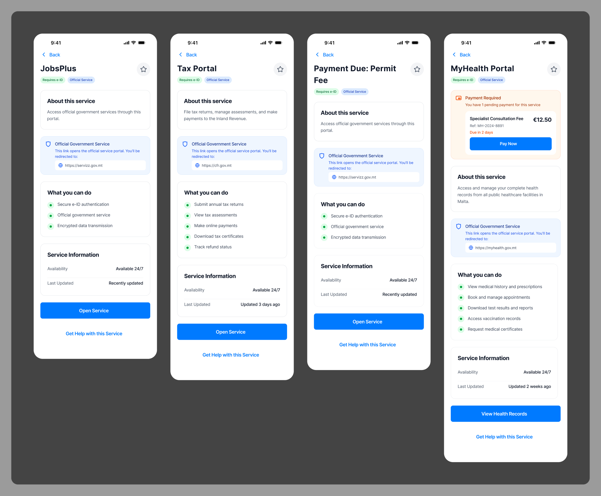
The concept organises everything around user needs rather than departments, held together by five stable areas: home, services, wallet, updates, and profile. Identity and documents live in a single wallet the citizen controls; forms share one validation and progress language; updates give a clear, honest picture of where each request stands. The result is one connected experience instead of a maze of separate portals.
Outcomes
Because Civis is a concept with no live users, I frame its outcome as a proposed service model rather than measured performance. The work argues — through consistent patterns, a life-context information architecture, and an accessibility-first interface foundation — how fragmented public services could become clearer, more accessible, and more scalable, without claiming any tested result.
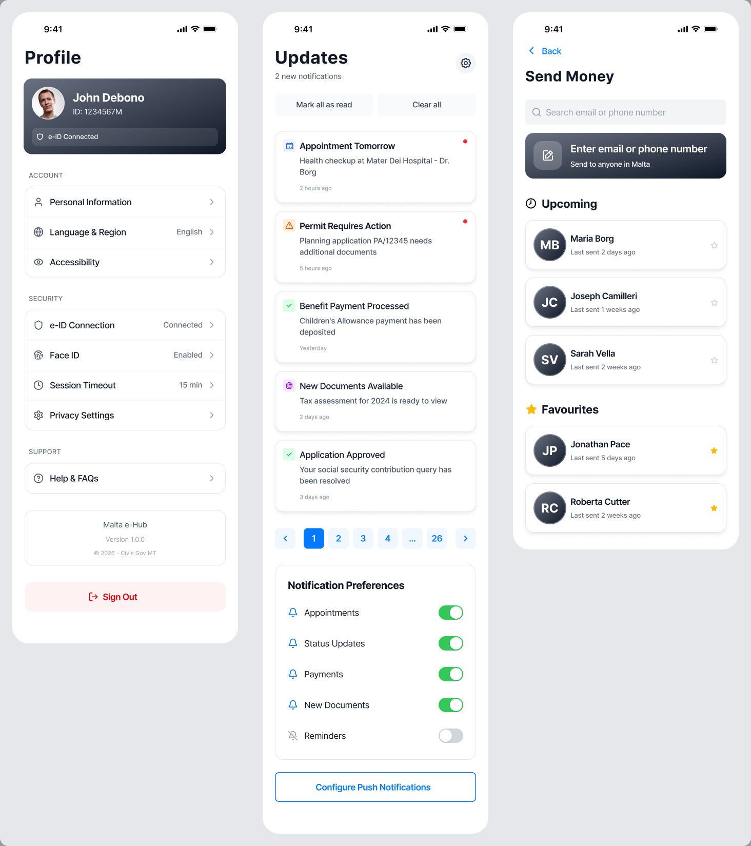
Group services around life context, not institutional ownership.
Public services should never require citizens to understand institutional complexity. The best service design absorbs the organisational mess and hands people a clear, calm path to completion — and treats accessibility as the foundation, not a later pass.