Twelve projects across design systems, product UX, audits, civic tech, and tools, built for complexity, regulation, and scale. Each one is told the same way: problem, process, key decision, trade-offs, solution, impact.
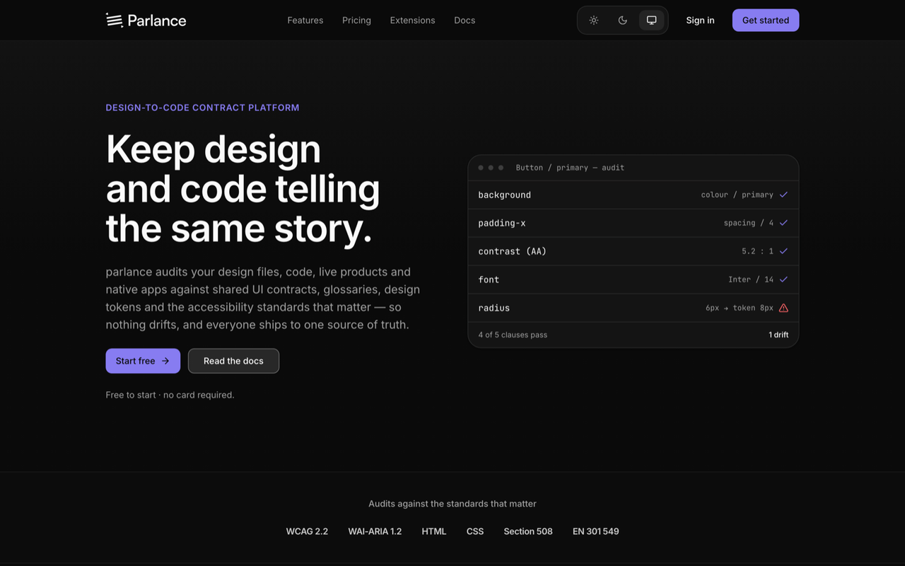
Parlance is the answer to the question every design system eventually faces: how do you keep design and code telling the same story once the system leaves the Figma file? It defines a contract — tokens, components, glossary, accessibility — and audits every surface a product lives on against it. Shipped and live at parlancelabs.net with paid tiers, one audit engine (the @parlancelabs/sdk) reaches from the web platform out to a Figma plugin, browser extensions for Chrome, Firefox and Safari, a VS Code extension, an Xcode extension, a native iOS auditor, and an MCP server for AI agents.
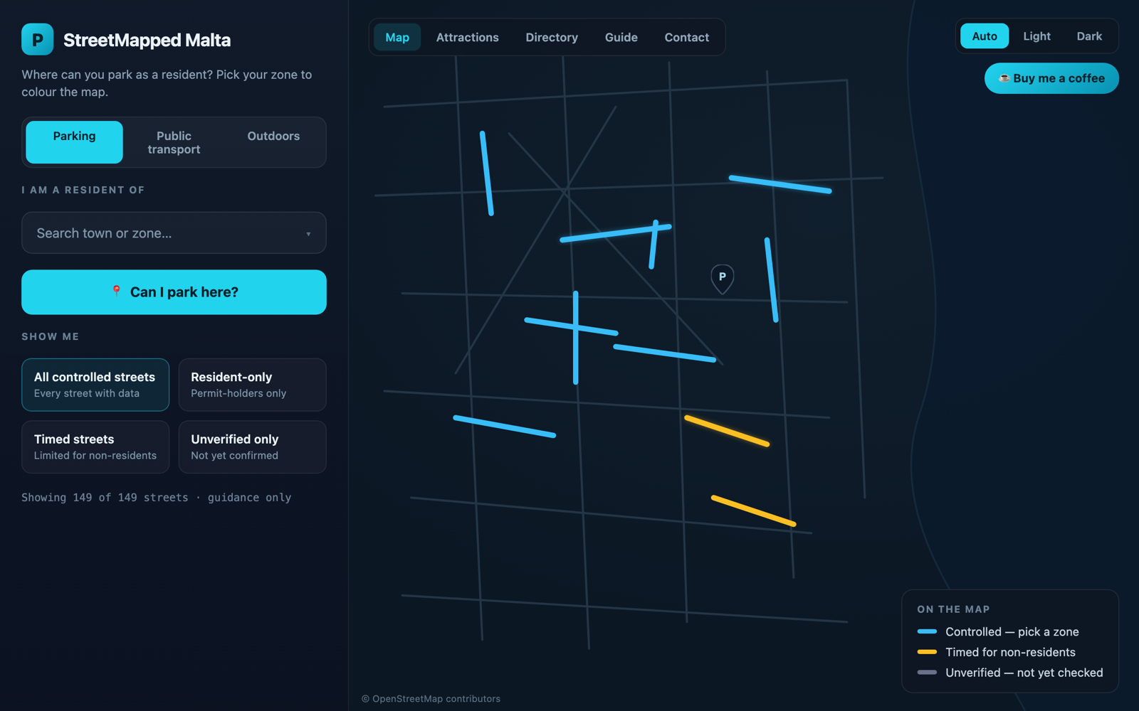
StreetMapped is a free map that tells Malta and Gozo residents who can park on which street — and, just as important, where the data isn't yet sure enough to say. Pick your resident zone and the streets recolour around you: green where you may park, red where it's reserved for another zone, amber where visitors get a time limit.
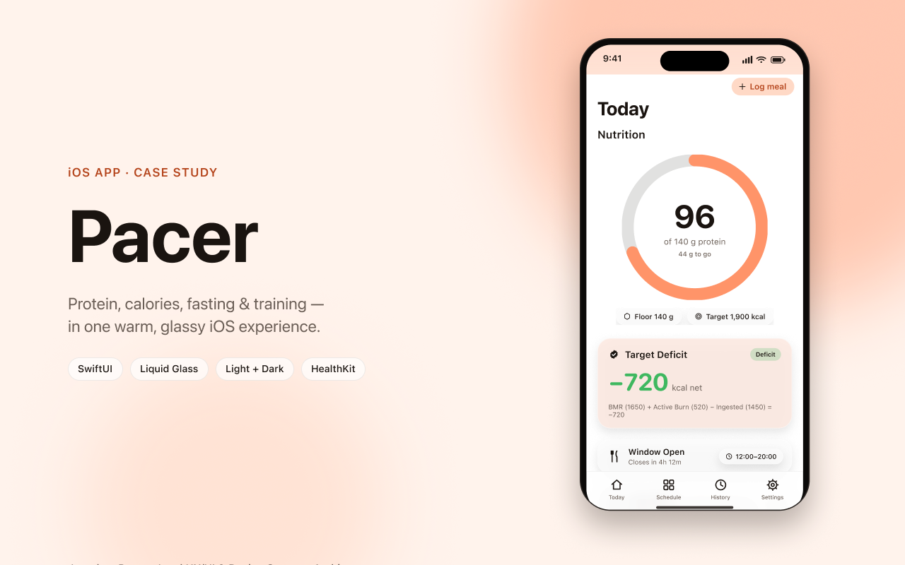
pacer started from a familiar failure mode: nutrition apps that bury the one number you came for under tabs, forms and noise. The goal was a daily companion you can read in a glance and act on in two taps — built as a real, themeable system across two native apps (member and coach) and a live web app, with the member's data kept private in their own CloudKit and only ever shared as one opt-in snapshot.
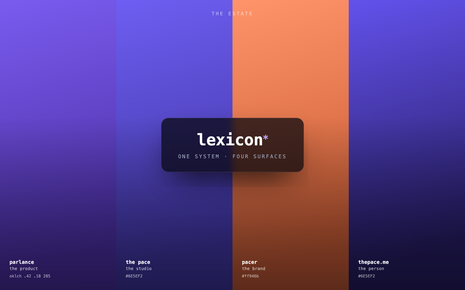
The estate is not four unrelated sites that happen to look similar. It is one design system — lexicon — and four surfaces that prove it holds.
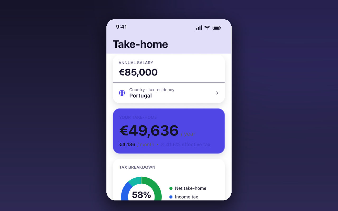
Nettaker answers one high-stakes question — "would my life actually be better somewhere else?" — and answers it honestly. Most salary tools stop at gross or bury you in tax detail.
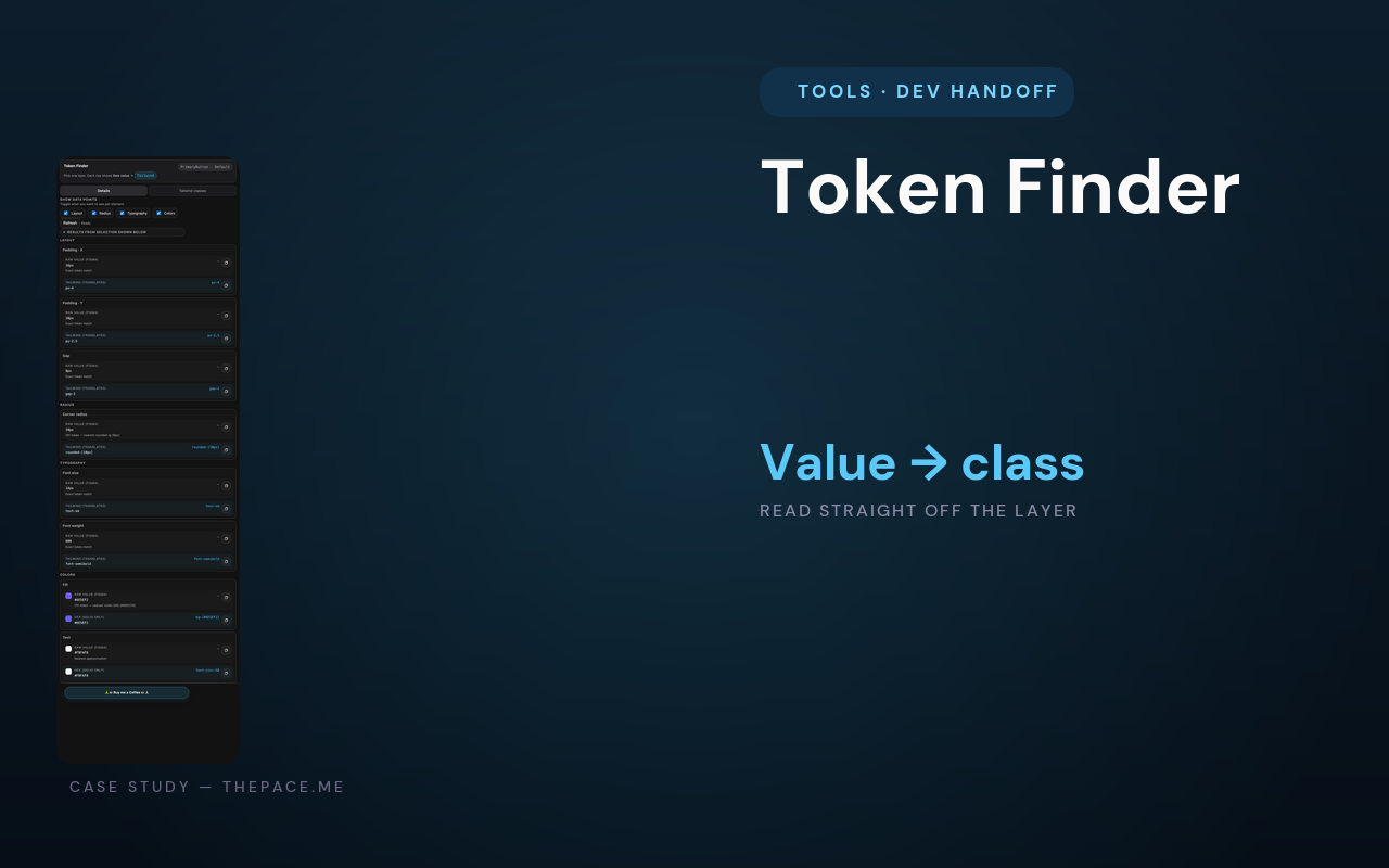
Token Finder kills the most boring tax in design-to-code: hand-translating "16px" into "p-4" and a fill's colour into a Tailwind class. Select a layer and the plugin reads its real padding, radius, type and colour and returns the classes.
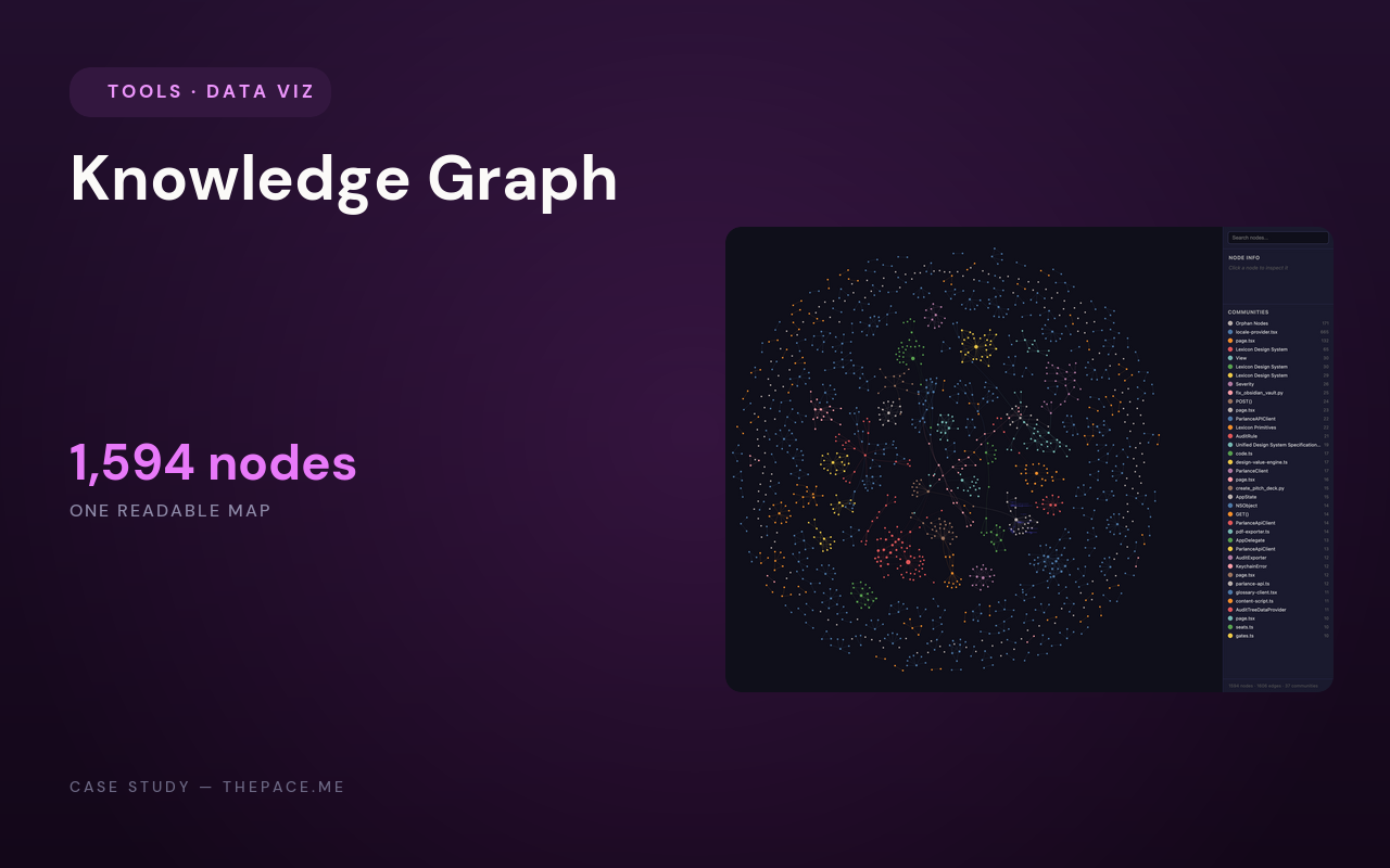
As the work grew — a platform, a design system, a portfolio, a browser extension, dozens of specs — the relationships between the pieces stopped fitting in anyone’s head. Knowledge Graph turns that sprawl into one designed picture: a force-directed graph of 1,594 nodes and 1,606 edges, reclustered into 37 communities and coloured, sized and glowed so the structure of the whole estate is visible in a single frame.
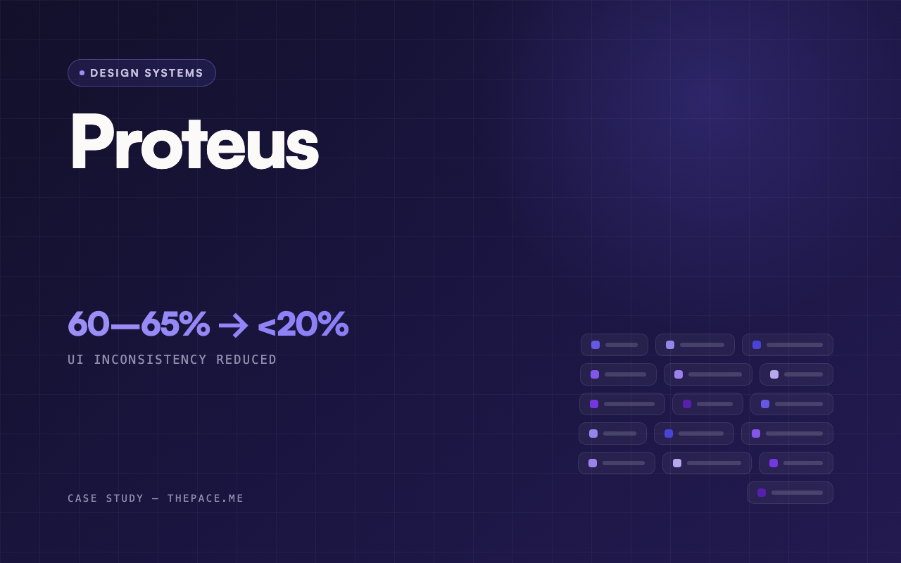
Proteus was created to solve a scaling problem. Multiple brands shared the same product core, but their interfaces had drifted apart across spacing, typography, components, states and behaviours.
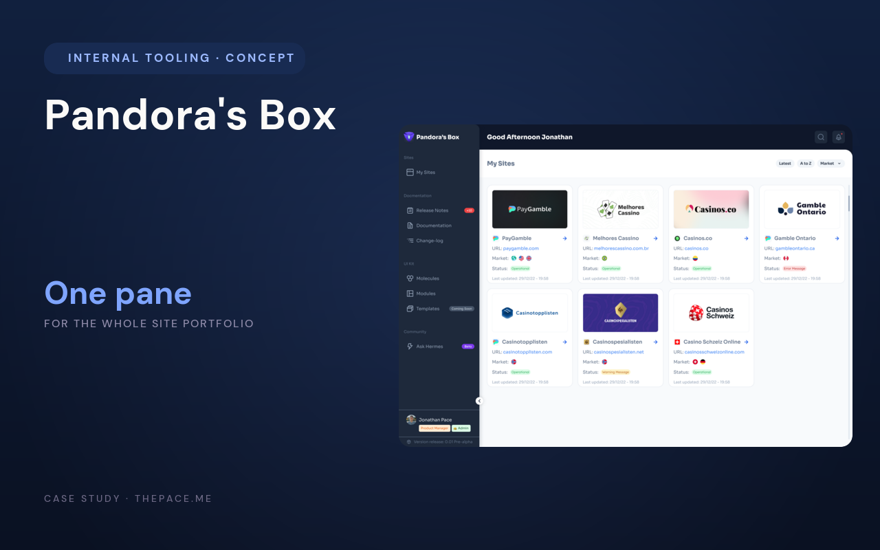
Pandora's Box consolidates the day-to-day operations of a multi-brand site portfolio: a live directory of every brand site with status and market, per-site Google Analytics and Core Web Vitals, design-system documentation, release notes, and a feedback loop wired straight into the delivery backlog. It is a concept, a designed operating model rather than a shipped product with real users, and it is built around one idea: the portfolio should have a home page.
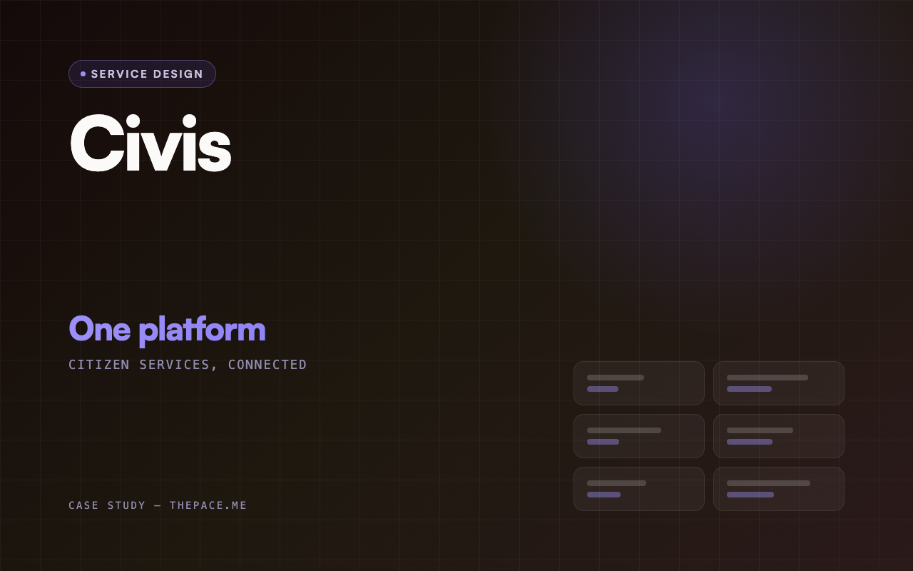
Civis is a concept that explores how government services could be redesigned around citizens rather than departments. Instead of asking people to understand how government is organised, it groups services by user need, life context, and the task they are trying to finish — then holds everything together with one consistent set of patterns for navigation, forms, identity, and updates.
This is an independent, self-directed audit of ComeOn Casino's public lobby — no client brief, no insider data, no analytics. I evaluated the live experience for usability, accessibility, content clarity and conversion friction, then translated what I found into a ranked, evidence-backed set of recommendations and a redesign concept that shows those fixes resolved in a real layout.
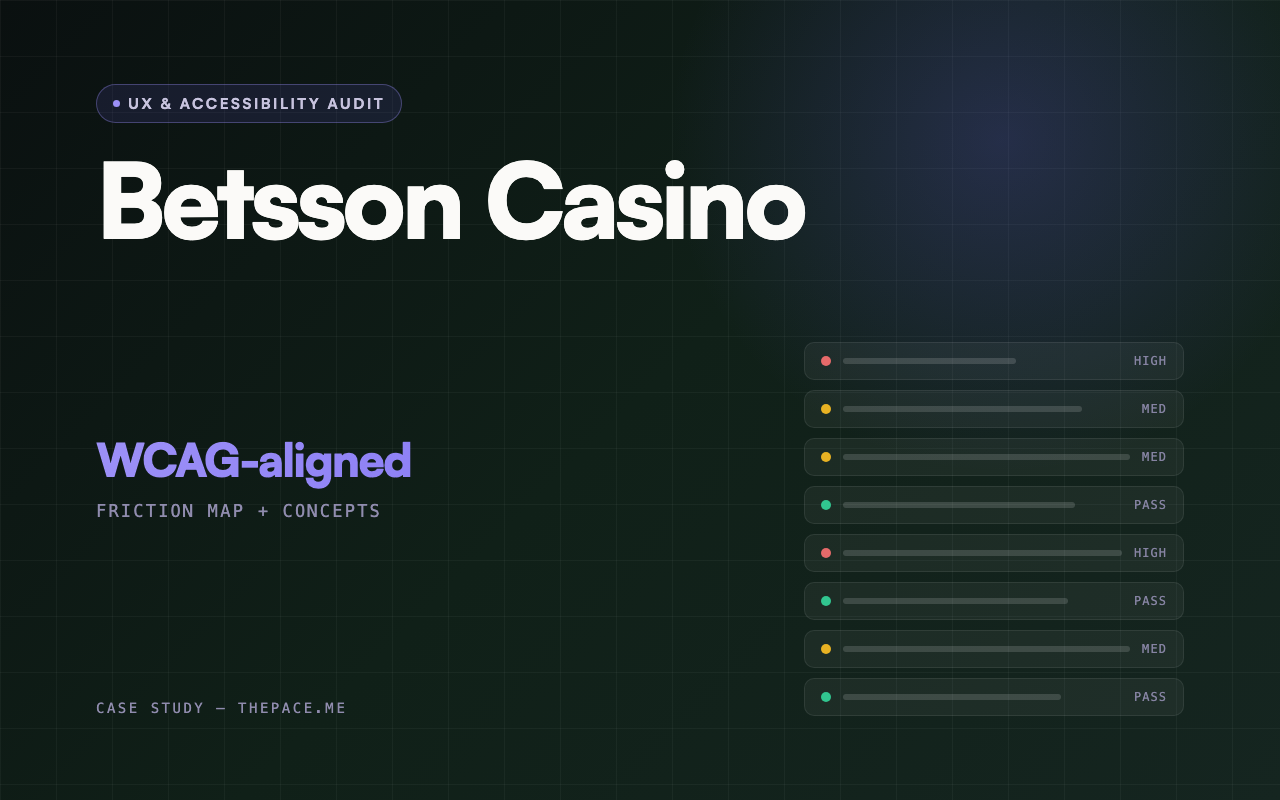
I reviewed the public Betsson Casino experience through three lenses at once — usability, accessibility, and interface clarity — to find where the product asks more of a person than it needs to. This was an independent audit of a live, public product: I had no client relationship, no insider data, no analytics, and no session recordings.