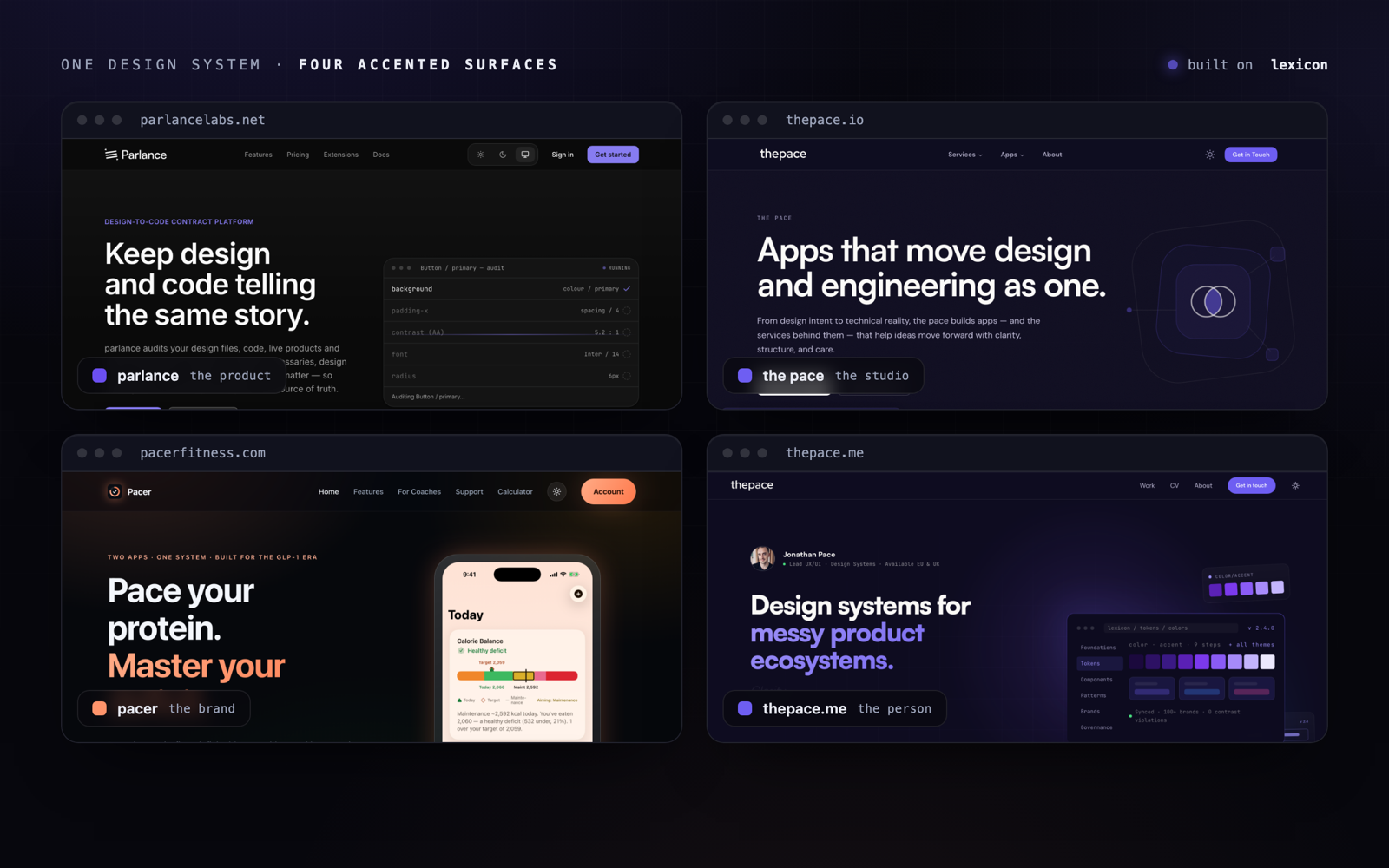
A design system is only worth the name if it holds up more than one thing. I maintain all of this alone — there is no team to catch drift, no review gate between a careless value and four live sites — so the discipline had to live in the system itself, not in my vigilance. lexicon is that system: one way to derive colour, one accessibility floor computed in lexicon's engine and carried into each site's own CSS, and one accent-swap model. The four public sites carry the method, not the code — none of them imports lexicon as a package, which is what lets each move at its own pace while the estate still reads as a single hand.
The challenge
The problem sits underneath all four sites at once: how do you make a product, a studio, a consumer brand and a personal site feel related without making them identical, when one person maintains all of them and there is no team to catch drift? A shared component library would couple them — one release could break four sites in a single commit, and none could move at its own pace. Four hand-rolled designs would drift apart. The token layer is where colour, type, spacing, motion and the accessibility floor actually live, and it was being re-decided from scratch on every site, in different colour spaces, with the contrast floor left to chance.
- Four surfaces that must read as one hand without looking the same
- One person, no team — the system itself has to catch the drift
- A shared package would couple the sites; a release could break four at once
- Colour, type and spacing re-decided from scratch on every surface
- The accessibility floor left to manual checking rather than computed
- One site (pacer) is also native, so tokens have to survive as data — CSS alone does not cross to a platform
Discovery & research
Before writing a line of token CSS, I treated the estate as a research problem: what do four independent sites actually need to share, and in which colour space should a system be defined so it survives translation to any platform? I audited each site's token layer and grounded the colour work in OKLab colour science, then codified the accessibility floor as something the engine measures rather than something I assert.
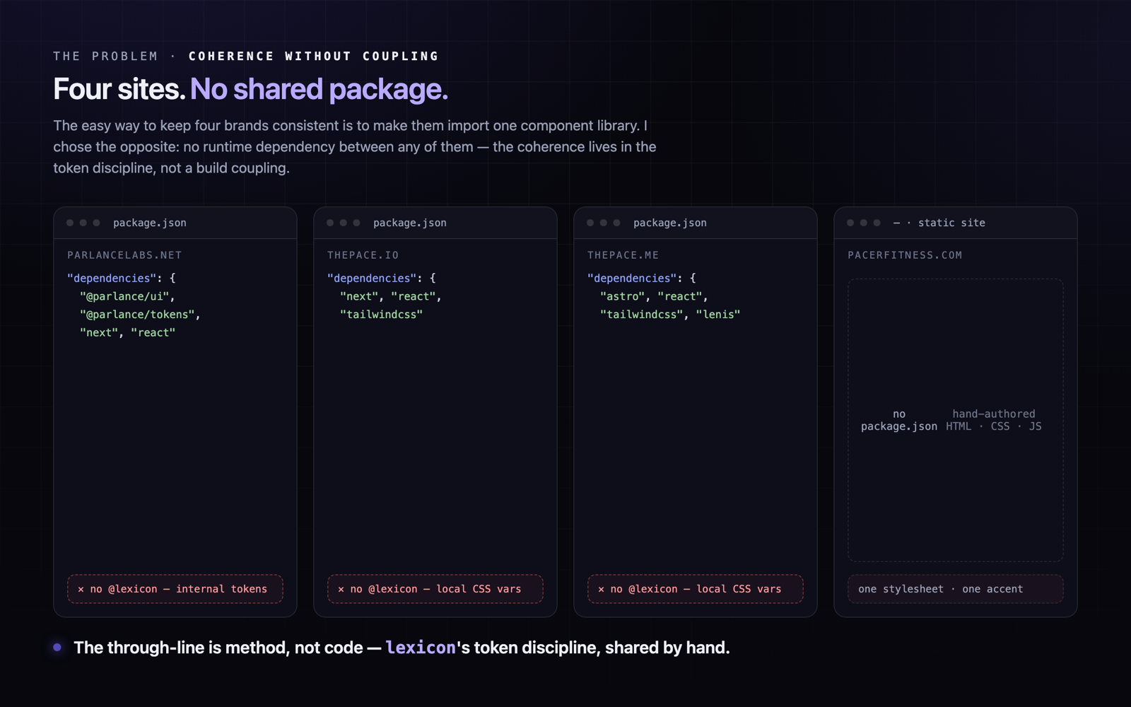
The sites share a discipline, not a dependency
None of the four public sites installs a shared design-system package; each authors its own semantic tokens. Coupling them through a package would have let one release break four sites, so the shared layer had to be method, not code.
EvidenceA grep across every package.json — parlance, thepace.io, pacerfitness.com, thepace.me — returns no @lexicon dependency, and pacerfitness.com has no package.json at all. lexicon's name survives only as an internal label in a parlance stylesheet comment ("Theme the driver.js popover with Lexicon tokens").
Colour should be derived perceptually, then shipped resolved
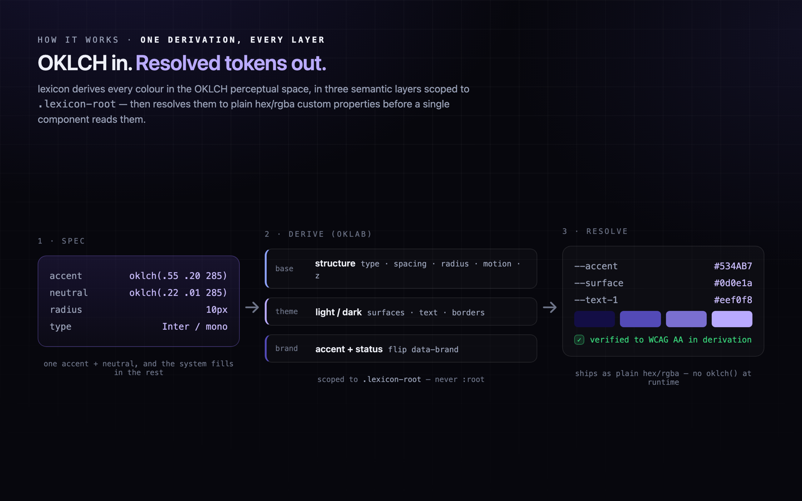
Authoring in OKLCH makes lightness, chroma and hue behave predictably across a theme, but runtime oklch() is not the deliverable. lexicon derives in OKLCH and emits resolved hex/rgba.
Evidencesrc/lib/theme-engine/color.ts carries hand-rolled sRGB-to-OKLCH (OKLab) maths with an in-gamut chroma-reduction loop in oklchToRgb; base.css and dist-lib/tokens.css ship resolved custom properties, not oklch().
An accessibility floor has to be computed, or it drifts
A stated AA commitment is not a guarantee. The floor holds only when contrast is measured against the hardest surface a colour will sit on and recorded as a number.
Evidencederive.ts computes text and on-accent colours with ensureContrast(...) and records each ContrastPair's ratio and required minimum; parlance's tokens.css documents severity-high moving from 3.31:1 (failing) to about 4.9:1, and keeps --input darker than --border to clear WCAG 2.2 1.4.11's 3:1 non-text minimum.
One property can carry a whole identity
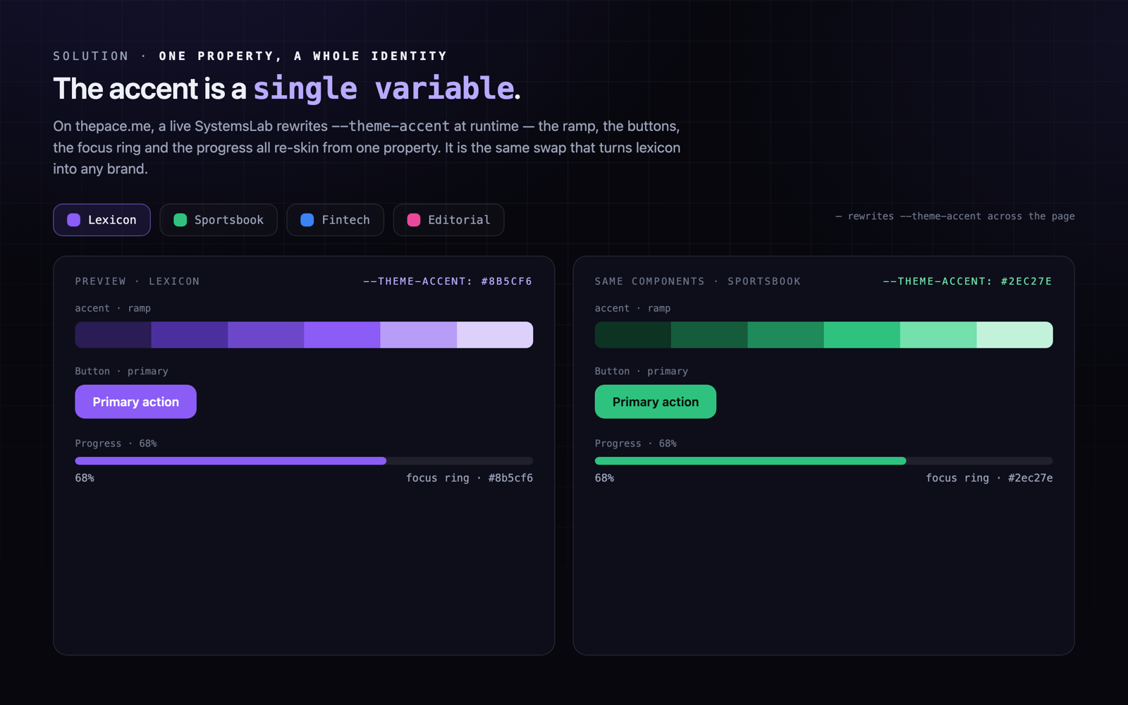
If accent and focus ring share a single hue and every accent shade derives from it, an entire brand swaps by moving one value — which is exactly what lets four sites diverge cheaply.
Evidencelexicon exposes a single --accent (with hover/active/deep/contrast/subtle/ring) flipped by a data-brand attribute and surfaced as a Tailwind utility; parlance's ring and accent both sit at OKLCH hue 285; thepace.me's SystemsLab rewrites --theme-accent at runtime across four brand chips.
Native is a translation problem, not a second codebase
CSS tokens do not cross to a native platform by themselves, but a format-neutral export and hand-matching a web accent to the platform's own make the translation cheap. Only one estate surface (pacer) is native, and lexicon ships no native SDK — this is translation, not a second codebase.
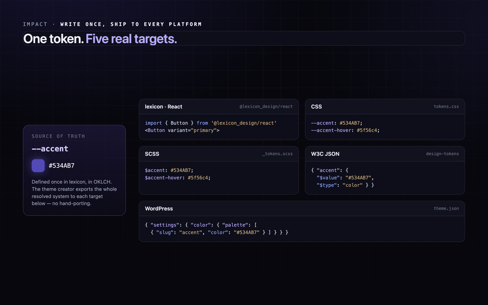
Evidencepacerfitness.com's coral #ff946b is hand-matched to the iOS app's AccentColor (sRGB 1.000/0.580/0.420); lexicon's theme engine serialises to W3C design-tokens JSON (Style-Dictionary compatible) alongside CSS, SCSS and WordPress theme.json.
How I approached it
I started with discovery, not CSS. I audited the token layer of every site — reading each globals.css, grepping the dependency graphs, checking which colour space each one authored in. That confirmed the shape of the answer: the sites did not need to share code, they needed to share a method. So I built lexicon to settle the method once. Colour is authored and derived in OKLCH — I hand-rolled the sRGB-to-OKLCH maths from Ottosson's OKLab so every token is computed in a perceptual space — then resolved to plain hex and rgba before it ships, because runtime oklch() is not the point; the derivation is. The accessibility floor is computed, not asserted: the engine measures each text-and-surface pair against the hardest background it will sit on and records its contrast ratio. On top of that base sit a theme layer (light and dark, both first-class) and a brand layer (a single accent property). Then I expressed lexicon four ways — the product, the studio, the consumer brand, the person — each choosing its own accent and voice while carrying the same floor.
Discovery: audited every site's token layer — dependency graphs, globals.css, colour spaces
Chose methodology over dependency — a shared discipline, not a shared package
Built the OKLCH derivation engine (hand-rolled OKLab maths, in-gamut chroma-reduction loop)
Computed the accessibility floor into derivation — ensureContrast against the hardest surface
Layered the tokens base to theme (light/dark) to brand (one accent property, scoped to .lexicon-root)
Expressed lexicon across four surfaces, each with its own accent and voice
Shipped the system to five targets — lexicon, CSS, SCSS, W3C JSON and WordPress theme.json — plus a Figma plugin and CLI
Trade-offs
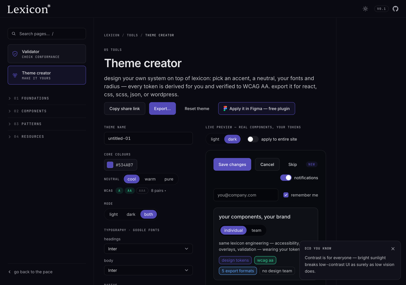
The hard part was restraint. It would have been easier to publish lexicon as a package and make all four sites depend on it — but then a system release could break the product, the studio, the fitness brand and my portfolio in one commit, and none of them could move at its own pace. So I held the line at methodology: the sites share lexicon's discipline, not its code. The cost is that discipline is now a human responsibility, backed by a CLI conformance validator that flags off-token colour rather than a compiler that enforces it. And I have kept lexicon honest about its own maturity: it is pre-v1 (0.1.x), React-only, with the theme-creator's export program still gated behind a "coming soon" flag.
- Holding the line at methodology when a shared package would have been easier
- Discipline is now a human responsibility, backed by a CLI validator, not a compiler
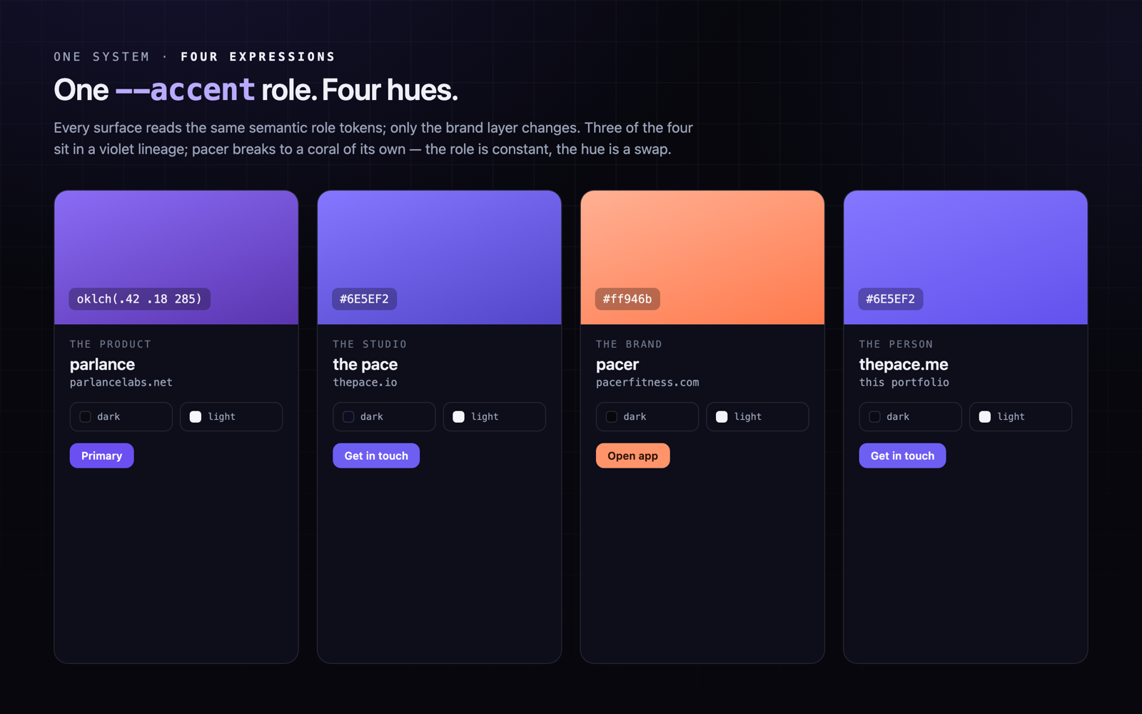
- One accent-swap model that had to hold across violet, indigo and coral
- An accessibility floor computed in lexicon's engine, then honoured again in each site's own CSS
- Honest maturity — lexicon is pre-v1, React-only, exports still gated behind a coming-soon flag
Final direction
lexicon is the deliverable: a three-layer token architecture scoped to its own .lexicon-root, a 122-component React library with zero runtime dependencies, a Tailwind preset that maps the whole scale onto utilities, a Figma plugin that runs the exact same derivation engine offline, and a CLI that scans a consumer repo for hardcoded, off-token colour. The four sites are its proof across platforms: parlancelabs.net, the design-to-code contract platform, in OKLCH violet at hue 285; thepace.io, the studio, in restrained indigo-violet, hosting the lexicon docs at thepace.io/lexicon; pacerfitness.com, the consumer brand, breaking to a coral matched by hand to the iOS app's accent colour (sRGB 1.000/0.580/0.420); and thepace.me, this portfolio, in the same indigo ink as the studio. One method, four accents, light and dark on every one, and an accessibility floor each of them carries — expressed in each site's own authoring (parlance in oklch(), the others in hex and rgb), because the discipline travels even when the colour space does not.
Outcomes
The estate is one colour system, derived once in OKLCH, carried across four independent sites with no shared package to couple them and no team to catch drift. One person derived the system, computed an accessibility floor into lexicon's engine, and expressed the same token discipline across a product, a studio, a consumer brand and a personal site — parlance in OKLCH, the others in hex and rgb — with the OKLCH values ready to translate to native through a format-neutral export rather than a shipped native SDK. parlance, at the centre of the estate, is built to audit design files, code, live URLs and native apps against WCAG 2.2, WAI-ARIA 1.2, Section 508 and EN 301 549 — which makes the estate a natural first target for its own engine. But the point is lexicon: it is the reusable artefact, and the four live sites are the evidence the method holds across surfaces.
One system, every screen
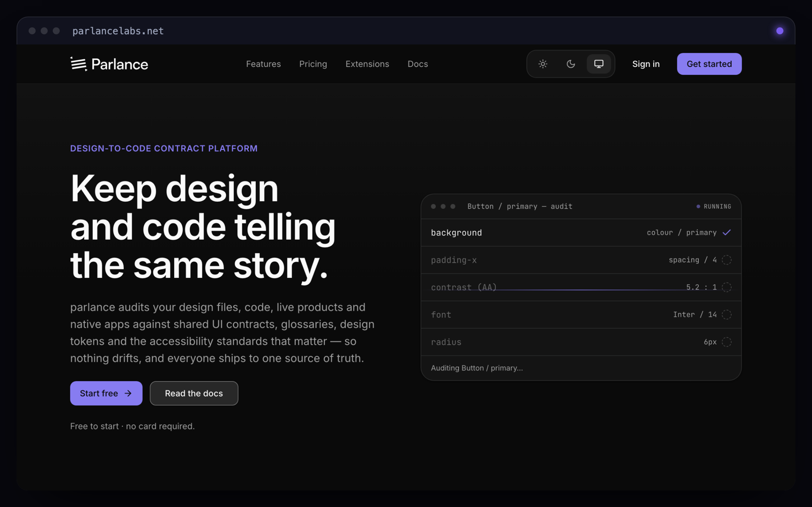
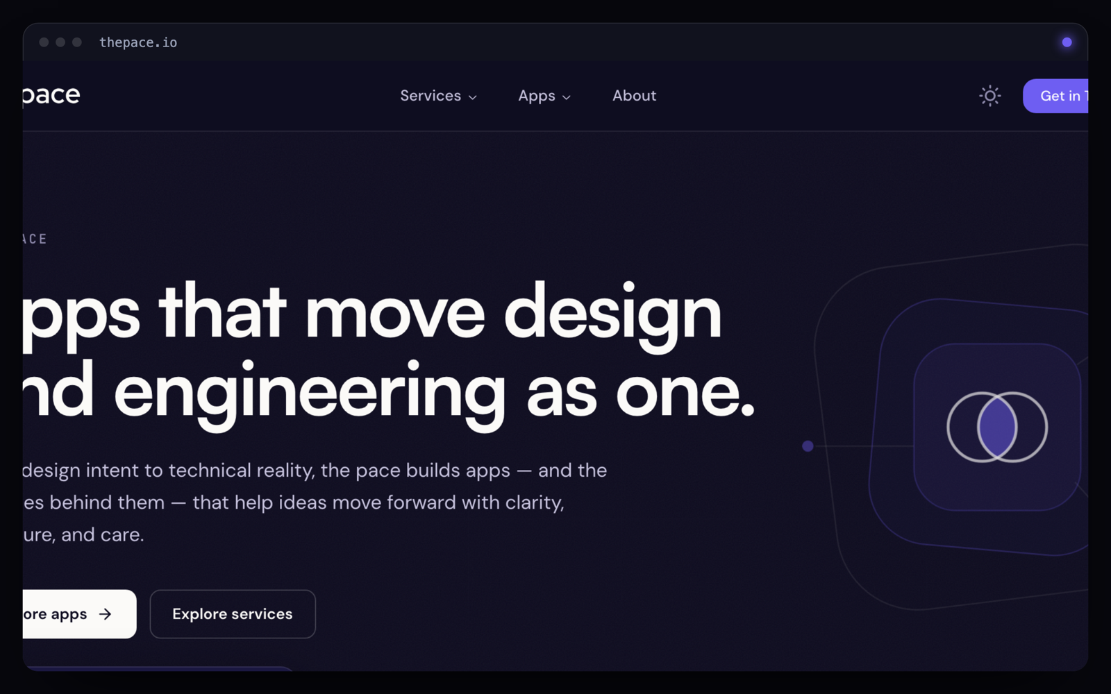
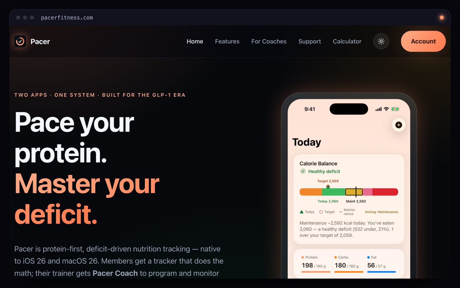
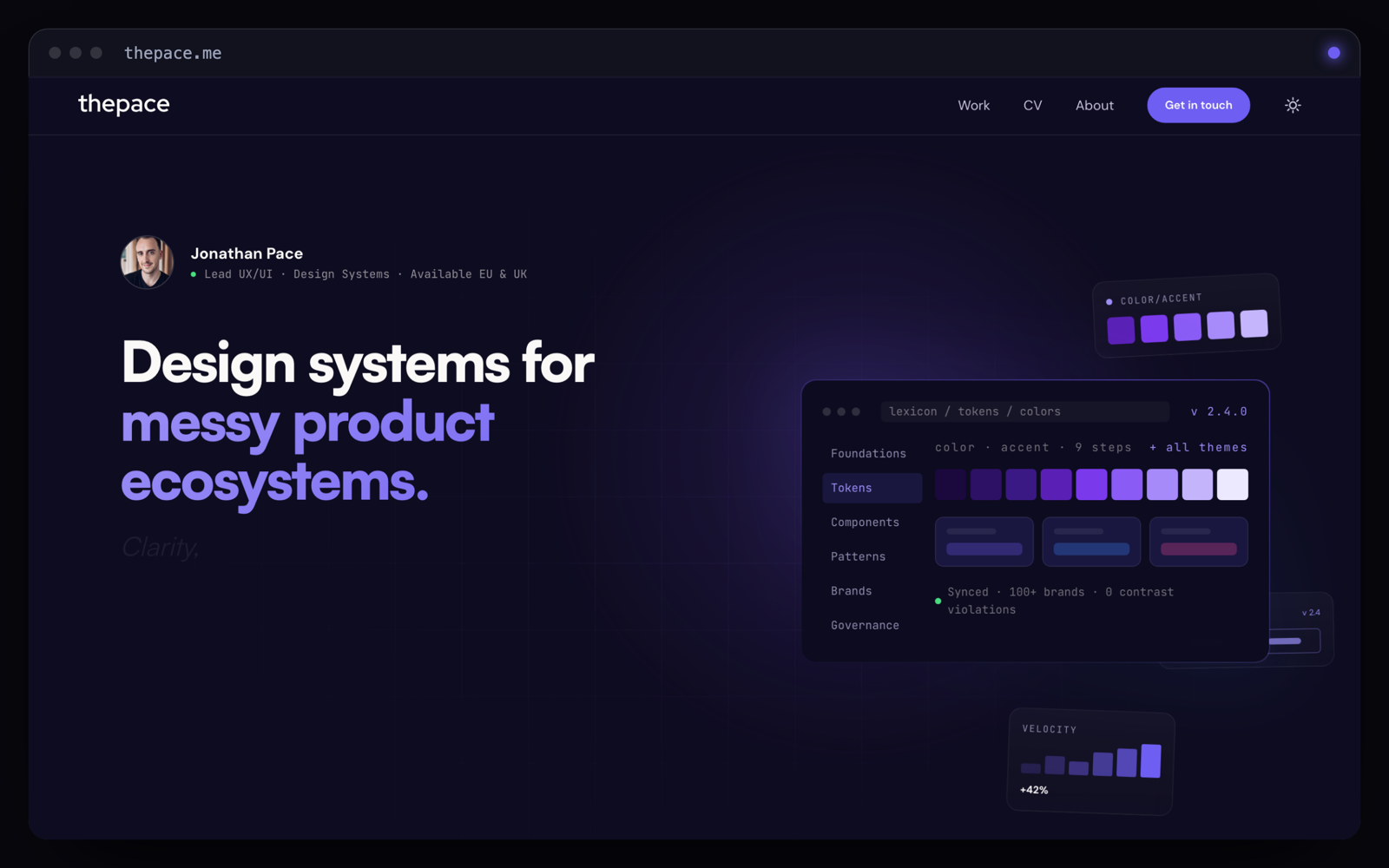
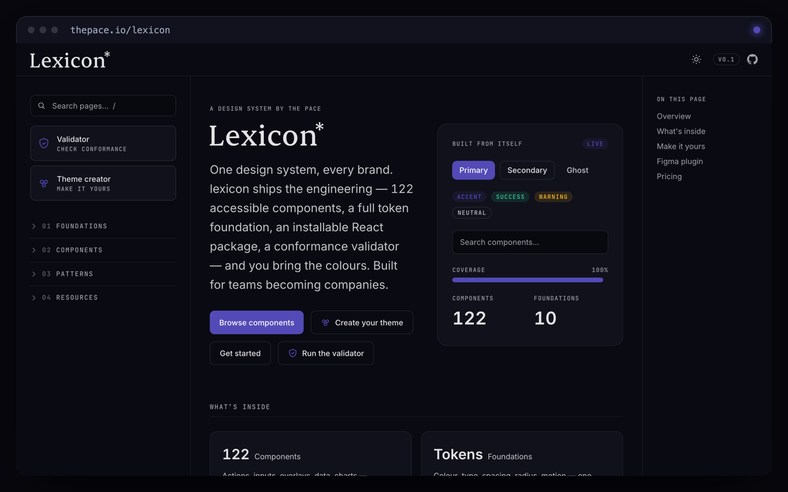
One derivation. Four surfaces. The system is the artefact; the sites are the proof it travels.
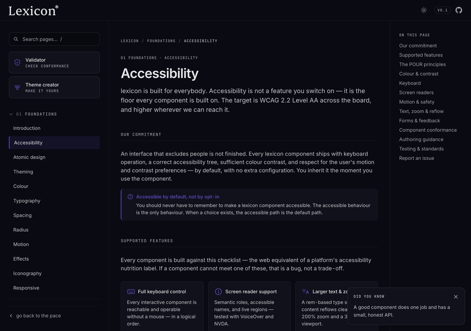
The proof isn't that the four sites match; it's that one derivation reaches React, CSS and Figma, translates to a native palette, and carries an accessibility floor — with no shared package binding the four sites together. That is the estate: one method, four voices, and evidence that the system travels.