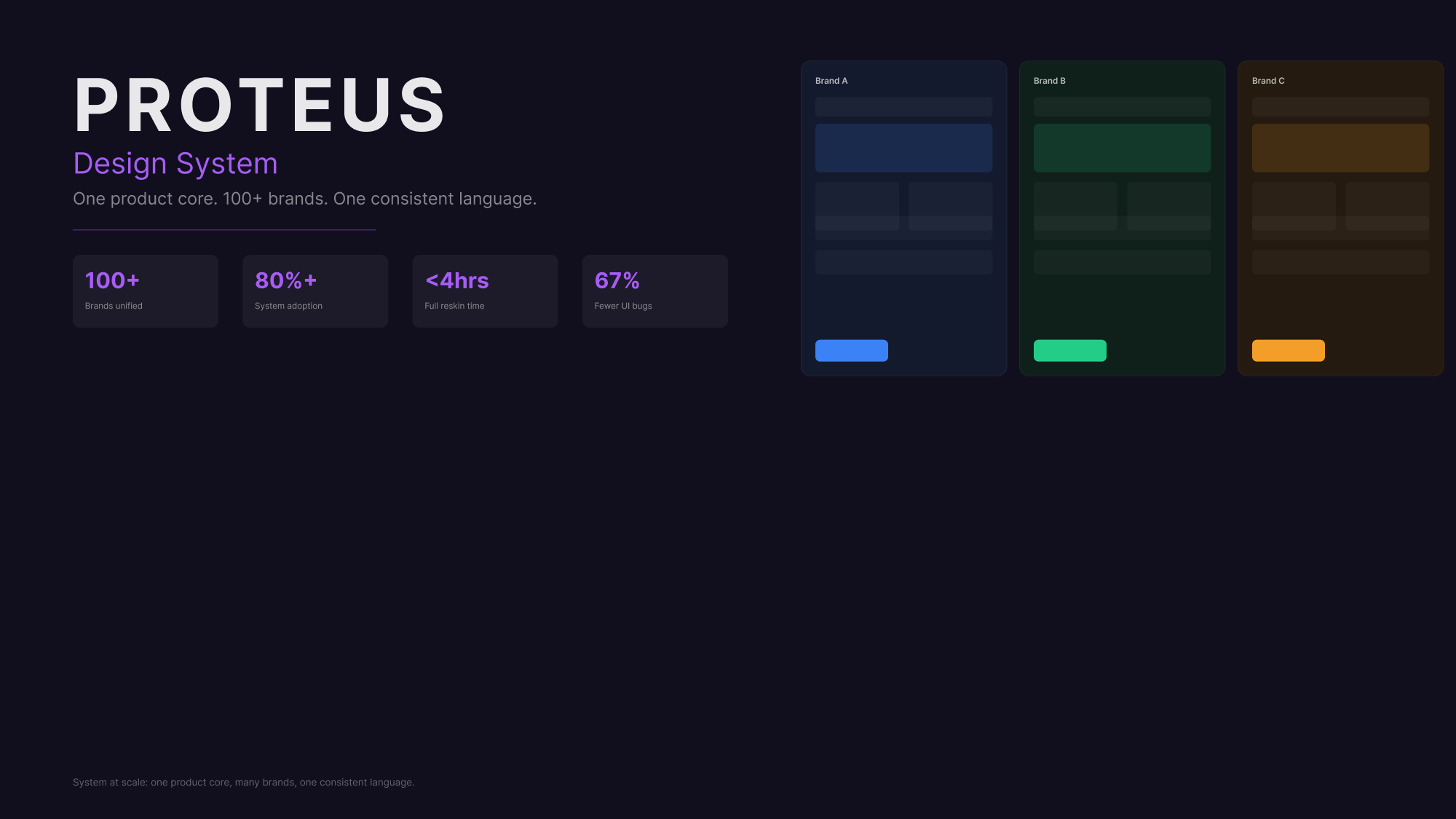
Proteus is a multi-brand design system platform built to bring consistency, speed and governance to a complex product ecosystem. Several brands shared one product foundation, but visual and behavioural drift had made delivery slower, QA harder and rebrands far more expensive than they needed to be. I focused the work on a token-first, component-led system that let each brand stay expressive while the underlying product experience stayed stable and reusable.
The challenge
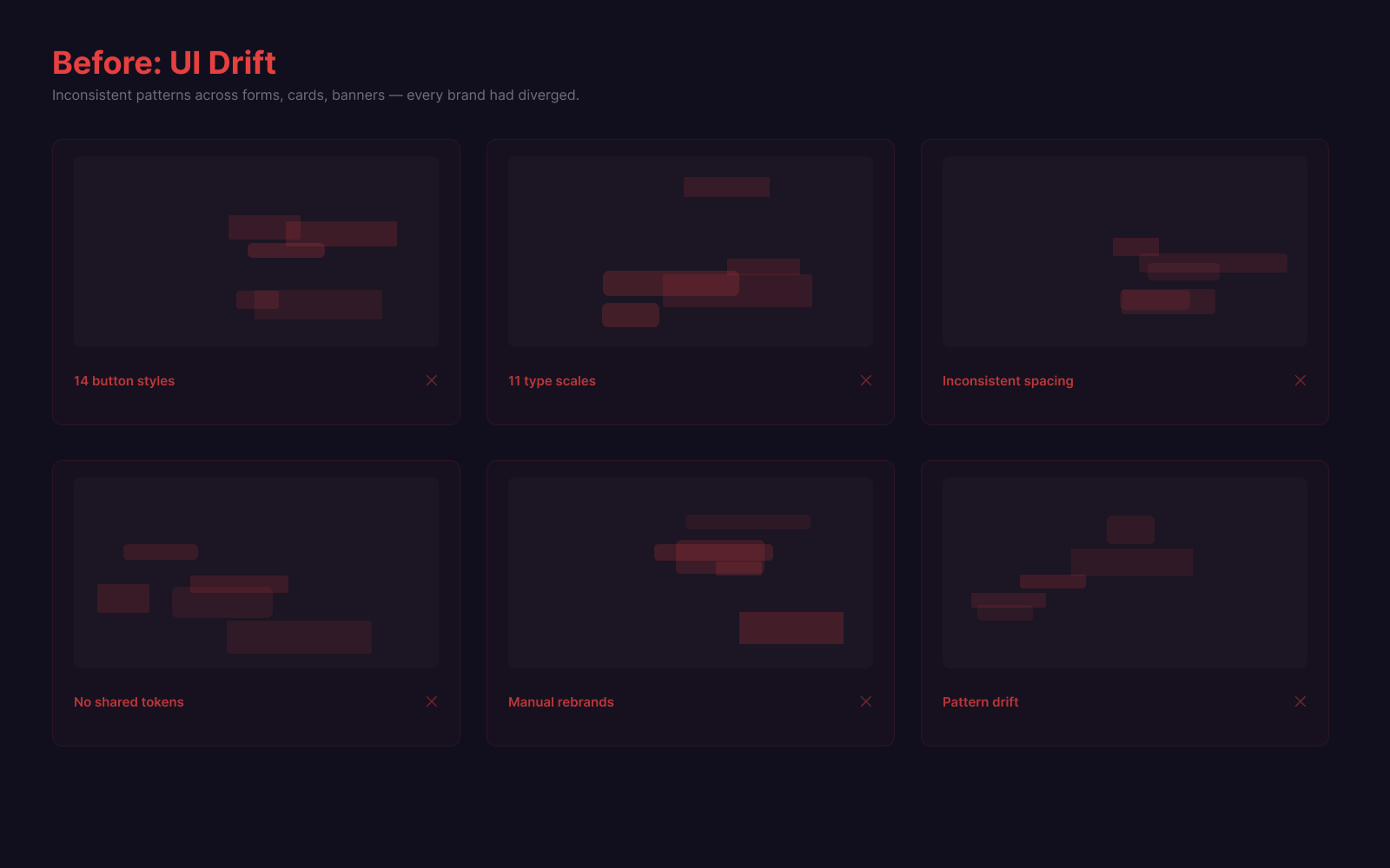
Design and delivery inconsistency had become a scaling problem rather than a cosmetic one. Multiple brands shared a single product core, yet each had drifted visually and structurally. Spacing, typography, components, states and behaviours diverged from brand to brand. Rebrands routinely turned into rebuilds, the same defects reappeared in forked copies of the same control, and quality depended too much on who last touched the interface.
- UI drift across multiple brands sharing one product core
- Inconsistent spacing, typography, components and behaviours
- Rebrands turning into full rebuilds
- The same defects recurring across forked copies of a control
- Low adoption of the shared component library
- No governance model for intake, review or release
- Too many one-off, team-specific solutions
Discovery & research
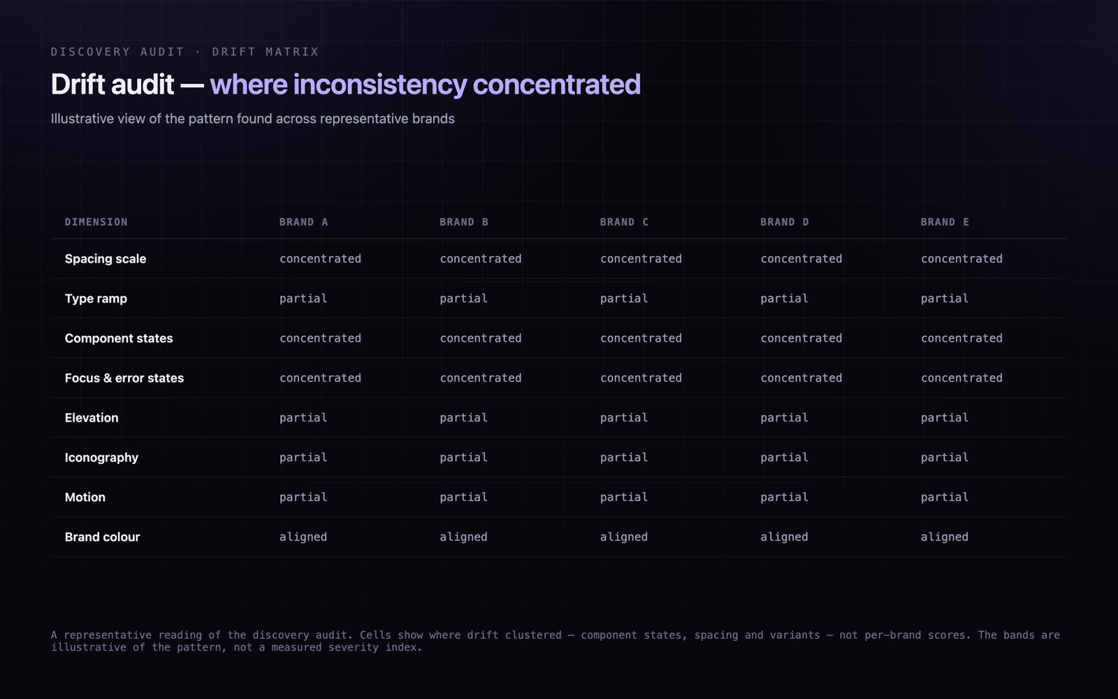
Before proposing a system, I ran a discovery pass to understand why brands sharing one product core kept drifting apart. Rather than a formal measurement programme, this was a qualitative audit: comparing the same components across brands, tracing where teams had forked the library, walking through a representative rebrand to see where the effort actually went, and talking to design and engineering about the gaps. The pattern was consistent — drift lived in states, spacing and variants, not in brand colour, and teams bypassed the library whenever it was slower than forking.
Drift concentrated in states and spacing, not brand colour
Teams already owned colour comfortably; the real inconsistency lived in interactive states, spacing rhythm and component variants, where no shared source of truth existed.
EvidenceComparing the same component across brands surfaced diverging focus, hover, disabled and error treatments even where the palette matched.
Teams bypassed the library because forking was faster
The shared components did not cover enough states and variants, so teams copied and edited them — quietly creating new drift each time.
EvidenceReviewing where components had been forked showed the common trigger was a missing variant or state, not disagreement with the design.
Rebrand cost was dominated by rebuild and re-QA, not visual design
Mapping where reskin effort went showed the bulk was re-implementing and re-testing existing screens, not designing the new look.
EvidenceWalking through a representative rebrand, most of the effort sat in rebuilding and retesting existing screens rather than defining the brand itself.
No shared semantic vocabulary meant intent was re-decided per screen
Without semantic tokens, every team re-chose raw values, so 'primary action' or 'danger' meant something slightly different in each brand.
EvidenceInventorying the values actually in use surfaced many near-duplicate greys, blues and spacings all expressing the same intent.
Governance was informal, so quality depended on who last touched the UI
There was no agreed intake, review or release path, so changes landed inconsistently and the same regressions recurred.
EvidenceInterviews with design and engineering pointed to the same gap: no shared route for proposing, reviewing or releasing a pattern.
One-off components multiplied the maintenance surface
Each fork had to be fixed on its own, so a single defect required many separate edits and often got missed in some copies.
EvidenceTracing repeated UI regressions showed the same defect reappearing across multiple forked copies of one control.
How I approached it
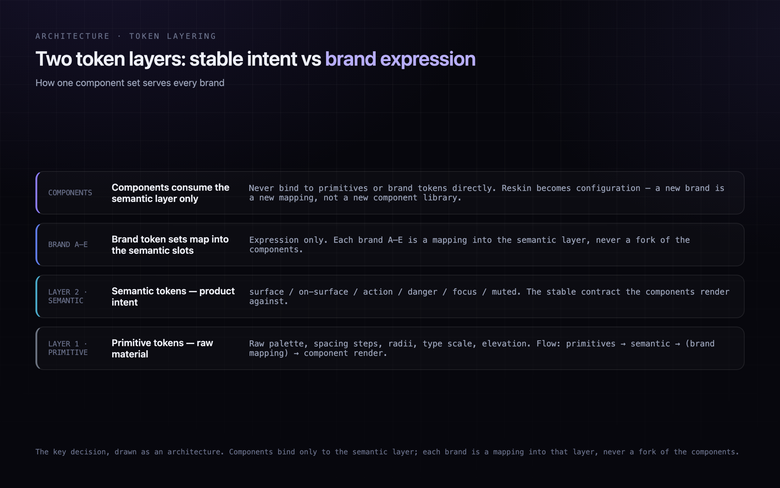
I started by finding where inconsistency actually appeared and why teams were bypassing shared patterns — usually because forking a component was faster than fighting one that lacked the state they needed. From there the system moved to a token-first model. Semantic tokens defined product intent — surface, action, danger, focus — while brand tokens carried visual expression. Components consumed only the semantic layer, so one component could support every brand without being duplicated.
Audited repeated UI patterns and where drift concentrated
Reviewed where and why teams were forking shared components
Mapped common component, state and layout needs
Defined a semantic token architecture for product intent
Connected each brand's expression to that semantic layer
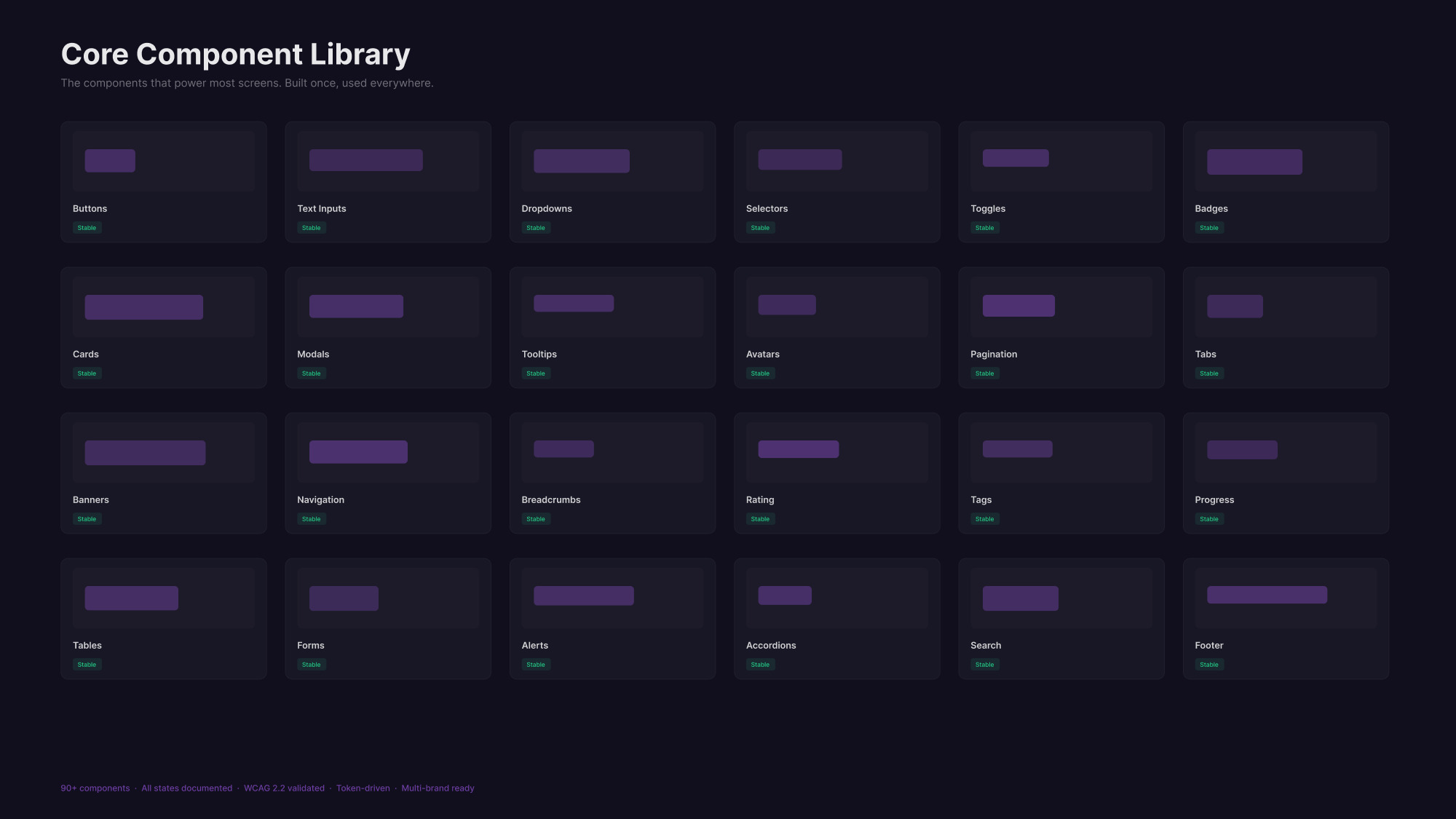
Built reusable components with explicit states and variants
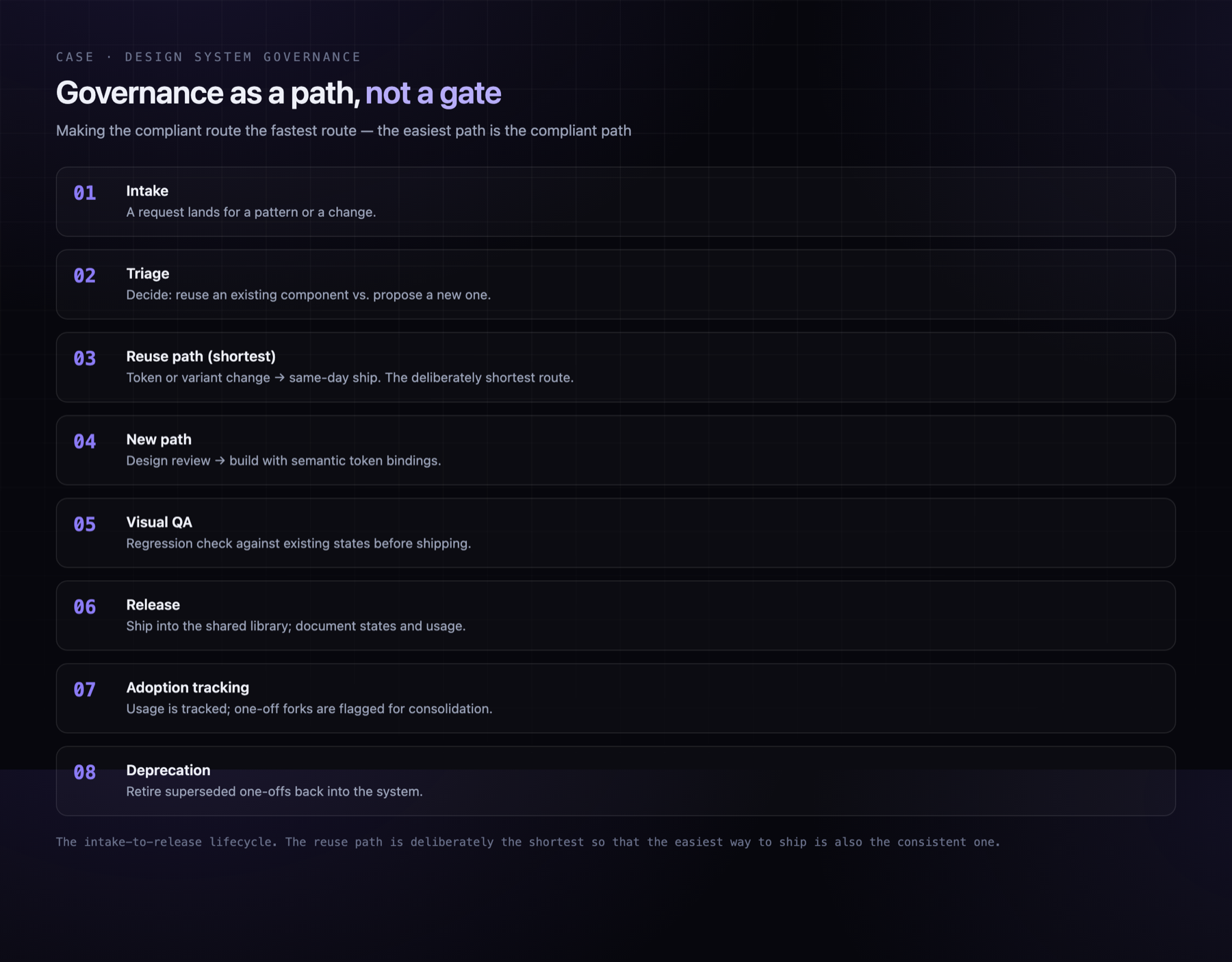
Introduced governance for intake, review, release and QA
Aligned design and engineering around one set of reusable rules
Trade-offs
The core challenge was balancing flexibility with control. Each brand needed to feel genuinely distinct, but the product still had to behave consistently. Too much freedom would recreate the original drift; too much rigidity would push teams straight back to forking. The system had to make the compliant path the fast path, or adoption would never hold.
- Driving adoption across independent teams
- Preventing a fresh sprawl of one-off components
- Supporting brand distinctiveness without breaking UX consistency
- Translating design rules into engineering-friendly token logic
- Making governance feel like a speed enabler, not a gate
Final direction
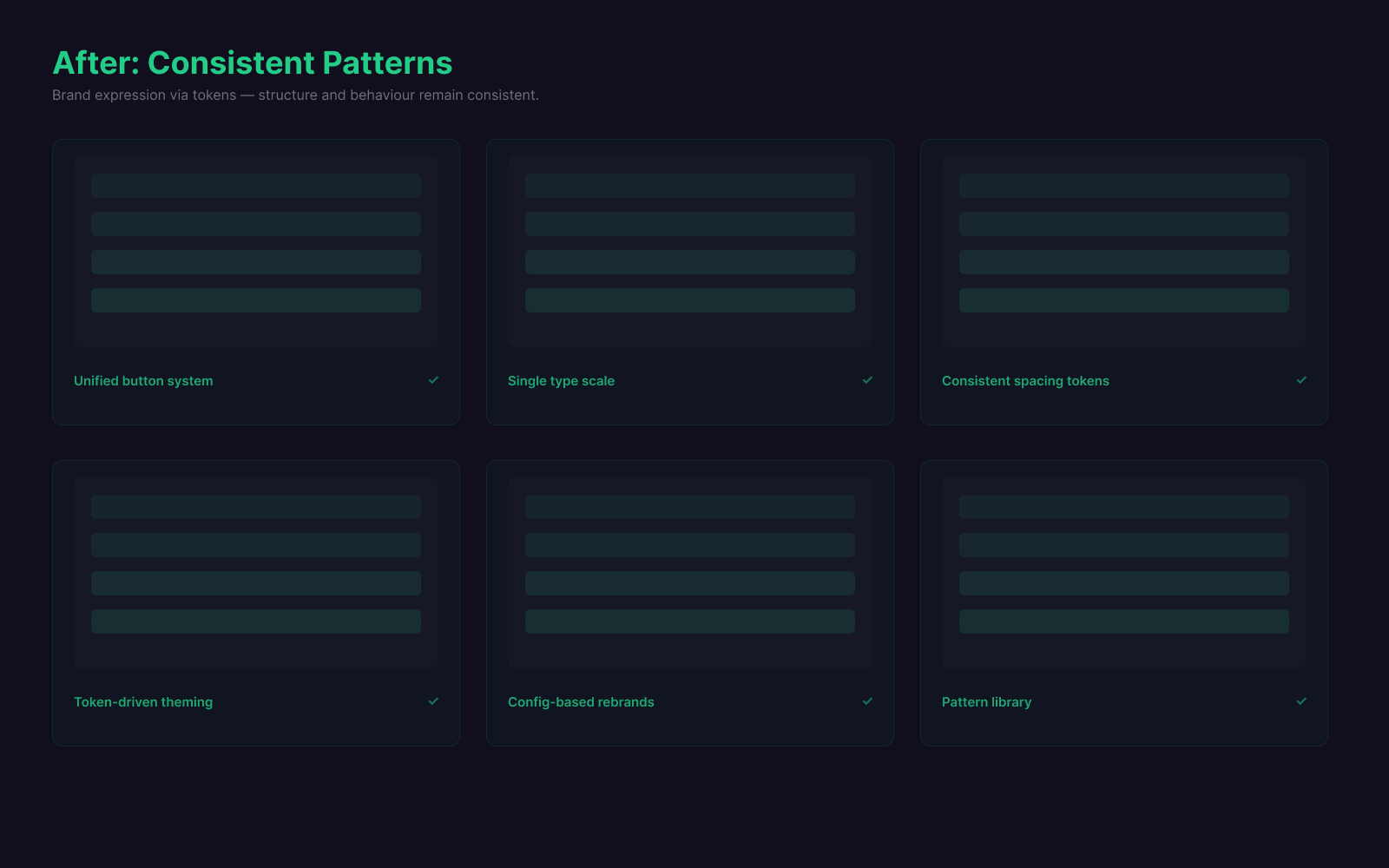
The final solution was a token-first, component-led design system. The foundation separated product intent from brand expression: primitive tokens fed a semantic layer, and each brand mapped into that layer rather than owning its own components. Components carried clear variants, states, spacing rules and behavioural expectations, and consumed semantic tokens only. Teams could reskin or adapt a brand through configuration instead of rebuilding the interface, and a governance path made proposing, reviewing and releasing shared patterns the easiest route to shipping.
Outcomes
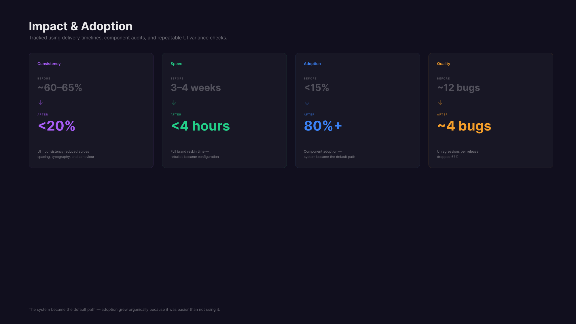
The change was structural, not cosmetic. Because components consumed the semantic layer, a fix made once propagated everywhere instead of being re-applied brand by brand, and a brand became a token mapping rather than a rebuild. That shift is reflected in the programme's own figures: UI inconsistency dropped from around 60–65% to under 20%, full brand reskins went from 3–4 weeks to under 4 hours, component adoption grew from under 15% to over 80%, and UI regressions per release fell by around 67%.
The goal was not to police design. It was to make the best path the easiest path.
Design systems are not really about components. They are about reducing decision debt. When the system is structured well, teams move faster, brands stay flexible, and quality becomes repeatable instead of depending on memory or whoever last touched the UI.