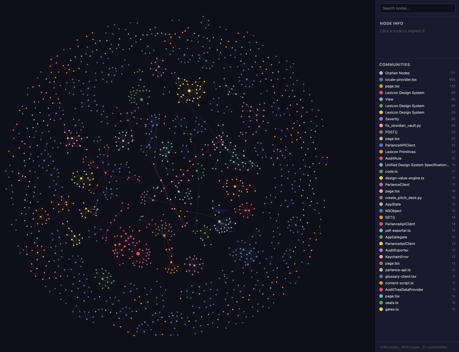
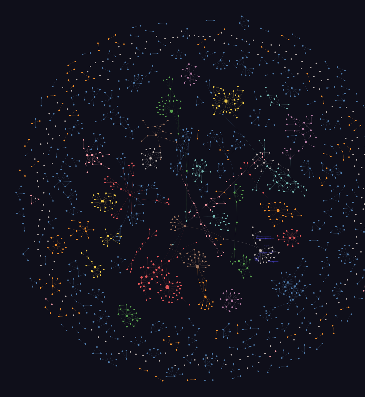
Knowledge Graph is an information-design piece, not a product. It draws a connected body of my own work — the parlance platform, the lexicon design system, the the-pace sites and their specs — from a knowledge base of roughly 1,600 notes and 1.5k source files, and lays it out as a single force-directed map. It exists to answer one question that folders and links can never answer at a glance: what is connected to what? The raw graph already existed, auto-extracted and auto-clustered by tooling. My contribution was the visual grammar that turns an accurate-but-noisy data structure into a picture a person can actually read.
The challenge
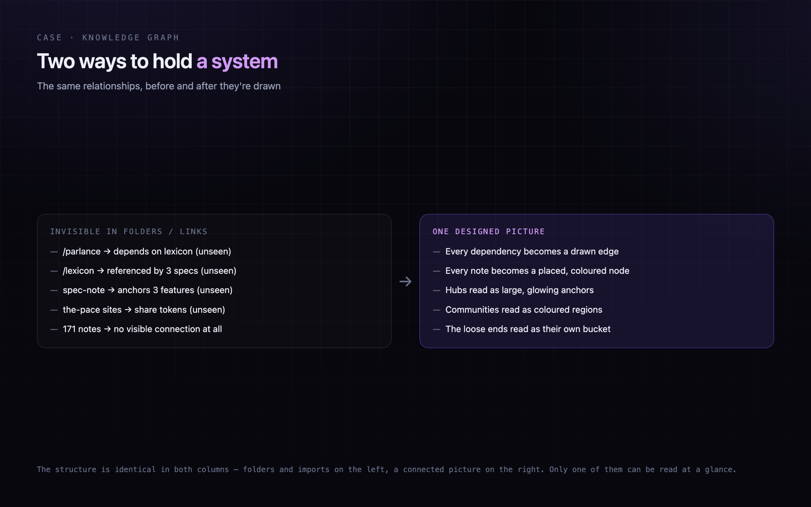
Systems thinking has an output problem. The relationships between projects, systems and decisions are real, but they live in folders, imports and cross-links where nobody can see the shape of them. You can feel that parlance depends on lexicon, or that a spec note anchors three features, but you cannot point at it. Without a picture, the structure stays in one person’s head and leaves when they do. And the naive fix — let a tool draw the graph — trades one illegibility for another: an honest force-directed drawing of ~1,600 connected nodes is a grey hairball, while a pretty drawing usually lies about the data.
- Relationships between projects and systems are invisible in folders and imports
- The structure of a body of work lives only in one person’s head
- An honest drawing of ~1,600 nodes is a hairball; a pretty one usually lies
- Default clustering over-fragments — meaning is there, but scattered and unnameable
- Importance and community are lost in a flat, undifferentiated link list
Discovery & research
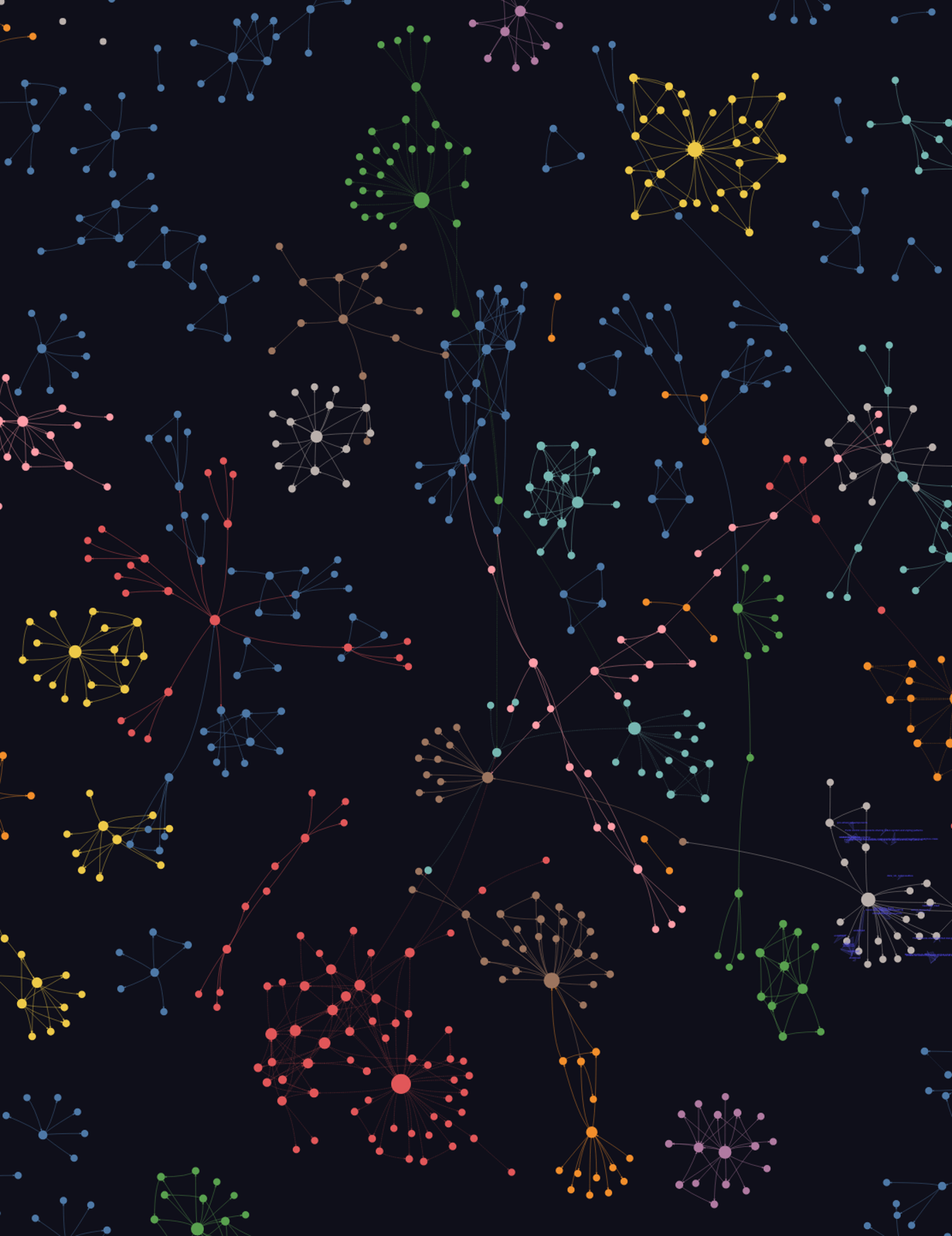
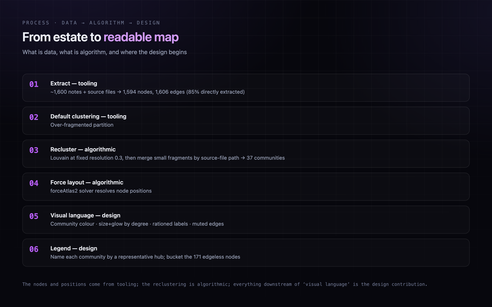
The raw graph already existed — auto-extracted from ~1,600 notes and source files, then auto-clustered by tooling. So the research wasn’t ‘what is the data’; it was entirely about legibility: what a 1,594-node graph must encode to be read at a glance, what to suppress so it isn’t a hairball, how to recluster an over-fragmented partition into nameable groups, and how a stranger can name the structure in seconds.
Accuracy and readability pull in opposite directions
A faithful drawing of ~1,600 connected nodes is a hairball; a pretty drawing usually lies. The whole design problem was keeping the truth of the extracted data while making its structure pop — a legibility problem, not a layout one.
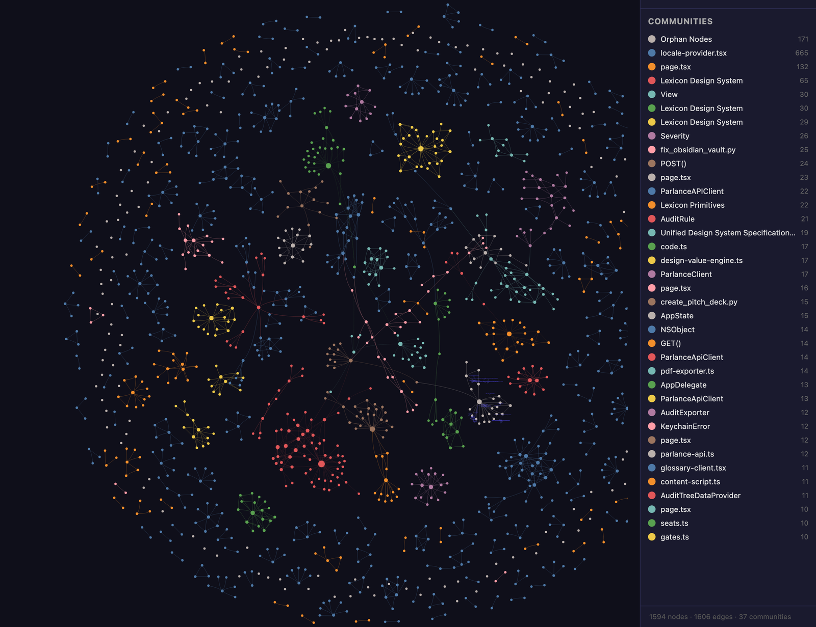
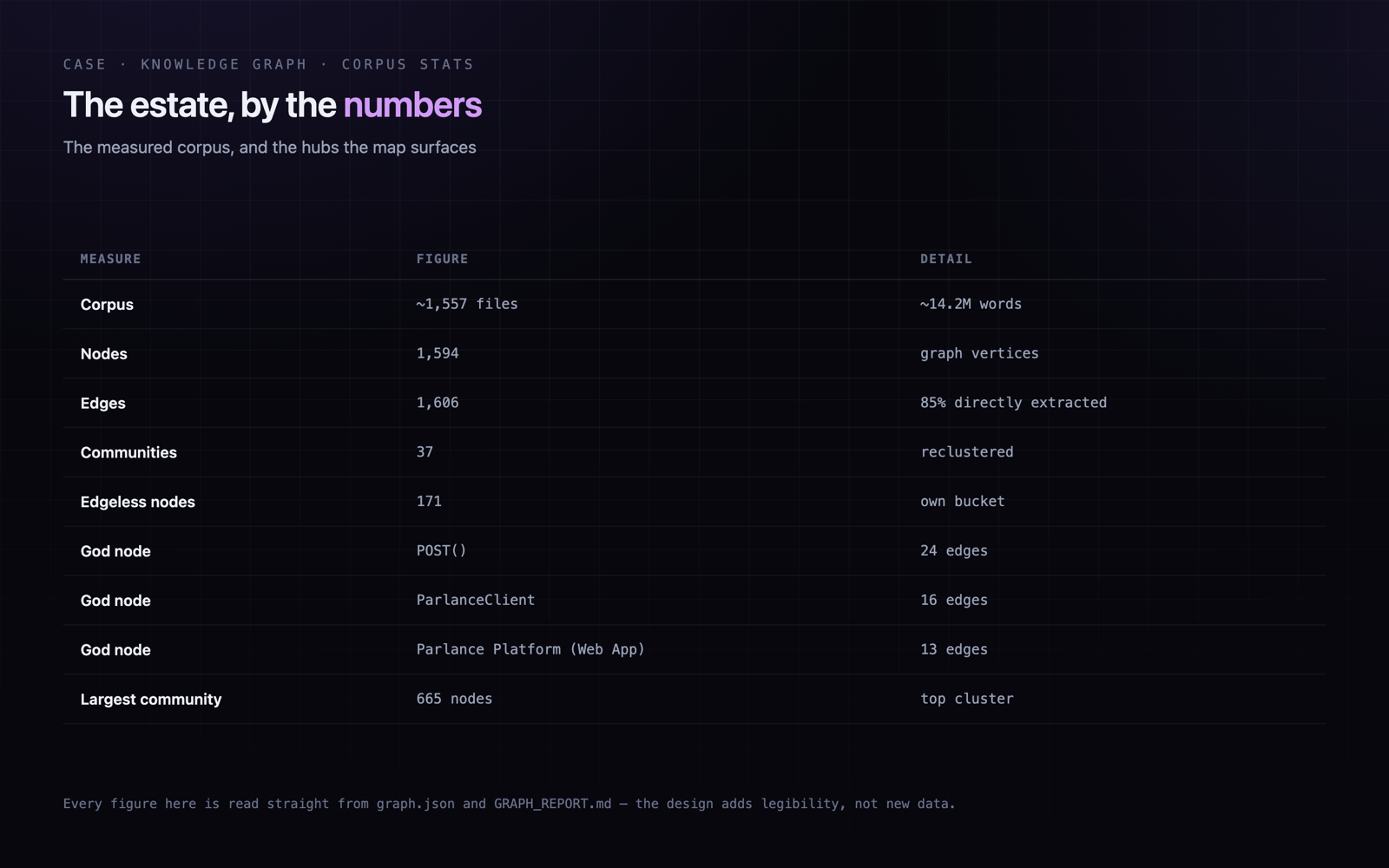
Evidencegraphify-out/graph.json holds 1,594 nodes, 1,606 edges and 37 communities; GRAPH_REPORT.md records 85% of edges as directly EXTRACTED (0% inferred/ambiguous), so the noise is real structure, not artefact.
The default partition over-fragments — so recluster, don’t hand-place
The map is more legible than the raw partition because of a second, fully algorithmic clustering pass — not manual grouping. Louvain runs at a fixed low resolution, then fragments smaller than the threshold are merged into the nearest large cluster by source-file path similarity. Nothing is hand-tuned into place.
Evidencerecluster.py calls louvain(subG, resolution=0.3) at a single fixed resolution (line 94) and merges sub-threshold fragments into the nearest cluster by source_file path — the community structure is emergent, not curated.
Some truths survive the recluster — and should be surfaced, not tidied
Reclustering reduces fragmentation but doesn’t erase what the data holds. lexicon still surfaces across several communities because it genuinely touches several parts of the estate, and 171 nodes carry no edges at all — they are edgeless by extraction, not by clustering choice. Rather than hide them, the map gives the edgeless nodes their own labelled bucket.
EvidenceIn graph.json the community labelled -1 holds exactly 171 nodes, and those 171 are precisely the degree-0 (edgeless) nodes; GRAPH_REPORT.md lists them as their own ‘Orphan Nodes’ community hub rather than scattering them.
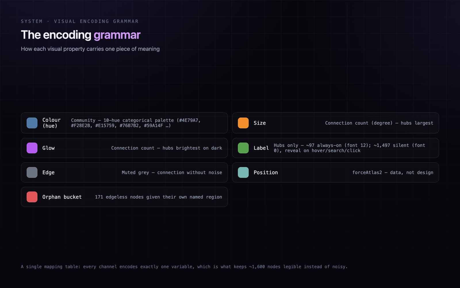
Importance has to be seen, not inferred — and labels rationed to hubs
The hubs carry the meaning of the system, so they had to be obvious without reading a label: importance is encoded as node size plus a glow on dark. Labels then follow the same logic — only the hubs keep a permanent, always-on label; the rest stay silent until you reach for them, or the frame becomes a wall of text.
EvidenceGRAPH_REPORT.md’s god nodes are POST() (24 edges), ParlanceClient (16) and Parlance Platform (Web App) (13); in graph.html 97 nodes carry an always-on label (font size 12) while ~1,497 ship at font size 0 and reveal their name only on hover, search or click.
Colour-coded clusters are useless if you can’t name them
Thirty-seven coloured regions say ‘there is structure here’ but not what it is. A legend names each community by a representative hub node — not always the single most-connected one — so the picture becomes navigable rather than merely decorative.
Evidencegraph.html colours communities from a ten-hue categorical palette (#4E79A7, #F28E2B, #E15759 …) and labels each by a hub; the largest community (665 nodes) is named ‘locale-provider.tsx’ even though its highest-degree node is actually ‘Parlance Platform (Web App)’ — so the name is representative, not strictly the top hub.
How I approached it
I started by auditing the raw material rather than restyling it. The extractor had produced 1,594 nodes and 1,606 edges at 85% direct extraction, but the default partition was over-fragmented, so the first move was a second clustering pass: Louvain at a fixed low resolution, then small fragments merged into the nearest large cluster by source-file path similarity — entirely algorithmic, no hand-placing. That pulled the estate into 37 nameable communities. From there the work was pure encoding. I gave each community a colour from a ten-hue categorical palette, sized every node by its connection count and added a glow on dark so the hubs read without a single label, muted the edges so connection shows without noise, reserved always-on labels for the hubs alone while the rest stay silent until you reach for them, and wrote a legend that names each community by a representative hub node. Even the estate’s honest edges got a home: the 171 nodes with no edges at all are edgeless by extraction, not by choice, so instead of scattering them I gave them their own labelled bucket.
Audited the extracted graph — 1,594 nodes, 1,606 edges, 85% directly extracted — before touching a pixel
Reclustered algorithmically: Louvain at a fixed low resolution (0.3), then merged small fragments into the nearest cluster by source-file path
Coloured nodes by community from a ten-hue categorical palette (parlance / lexicon / the-pace and beyond)
Sized and glowed nodes by connection count so hubs are obvious with no labels read
Reserved always-on labels for hub nodes; left the other ~1,497 silent until hover, search or click
Muted the edges to show connection without turning the field to noise
Wrote a legend naming each community by a representative hub, and gave the 171 edgeless nodes their own bucket
Trade-offs
The recurring tension in any knowledge graph is that accuracy and readability pull against each other, and the honest move is usually the less flattering one. Reclustering makes the estate far more legible, but it does not — and should not — erase the truths the data holds. lexicon still surfaces across several communities because it genuinely touches several parts of the estate; 171 notes carry no edges at all because extraction found none. The temptation is to tidy those away for a cleaner picture. I chose instead to surface them honestly — lexicon’s spread reads as reach, the edgeless notes get their own named bucket — so the map stays a truthful instrument rather than a flattering poster.
- Keeping ~1,600 nodes readable without hiding the truth of the data
- Rationing labels to hubs so shape reads first and detail reads on request
- Reclustering for legibility while refusing to erase what the graph honestly shows
- Surfacing edgeless nodes and cross-community reach as insights, not defects to tidy away
- Making a technical, auto-generated artifact feel like a deliberately designed object
Final direction
The final piece is a dark, glowing, clustered map of the whole estate in one frame: parlance, lexicon and the the-pace sites drawn as 1,594 nodes and 1,606 edges, coloured into 37 communities from a ten-hue categorical palette, sized and glowed by connection count so hubs like POST(), ParlanceClient and the parlance platform node read instantly, edges muted, labels reserved for the hubs, and a legend naming each community by a representative hub node. It is honest by design: lexicon appears across several communities because it truly reaches across the estate, and the 171 edgeless notes sit in their own labelled bucket rather than being hidden. It works as both a navigational instrument — click a hub, its neighbourhood lights up, its name appears — and a portfolio statement about how the pieces fit.
Outcomes
Knowledge Graph is a small but pointed demonstration of systems thinking made visible: an accurate, unreadable data structure turned into a designed picture that communicates the shape of an entire body of work at a glance. Its value is legibility, not new data — nothing in the map isn’t already in the estate’s files and imports. The measurable facts are the corpus itself (1,594 nodes, 1,606 edges, 37 communities, 85% directly extracted), and what the design adds is the ability to read them: to see in one frame that parlance is the estate’s centre of gravity, that lexicon reaches across it, and that a long tail of notes still sits unconnected — each of them a true observation the picture surfaces rather than an artefact it invents.
You cannot see a system until someone draws it.
Systems thinking is invisible until you draw it. The job of the visualisation was never to add information — every edge was already latent in the files — but to make the structure that was already there finally readable, and to stay honest about the parts that don’t tidy up. A good map of a system shows you its spine and its loose ends in the same glance.